Rachel has used punchy colours, gold accents and dark walls to give her Victorian home a bold, eclectic vibe. Here she shares her makeover story...
My story
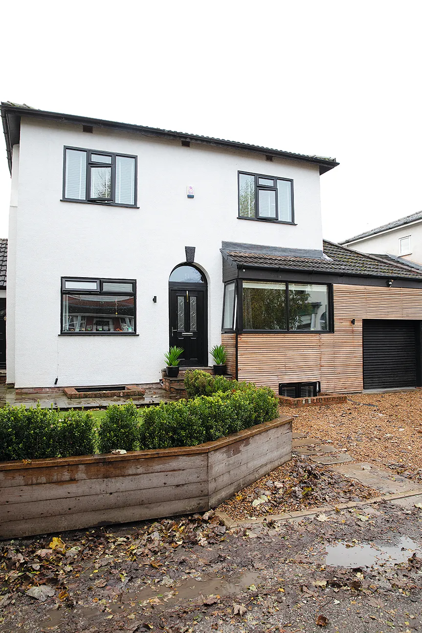
We viewed loads of properties when we decided to upsize, but struggled to find anything bigger within budget. The only reason we could afford this four-bed house was because it was a wreck! Renovating it in stages, we moved from room to room while each space was completed.

The biggest change was converting the rear part of the double-height garage into a kitchen. Then six months later, we converted the four cellar rooms into a storage area, bar and guest bedroom. I love luxe touches on a budget and I’m obsessed with the interiors of grand manor houses so I’ve tried to capture that drama and over-the-top detail in our home.
Welcome to my home...
A bit about me I’m Rachel Runciman, 32, and I work with my husband, David, designing interiors for our property renovation business. We live with our son, Rudy, five, daughter, Patti, who’s one, and Susan the cat.
Where I live Our home is a four-bedroom detached Victorian house in Sale, Manchester. We bought it in November 2016.

David’s style is completely different to mine – he says I have too much stuff – but he normally gives me free rein with the interior design. His forte is finding bargains and getting good deals as he’s a bit of a Del Boy! I feel like the kitchen, dining room and living room flow together well now, whereas elsewhere every room is a little bit different, which I love.
In the future, David would love to move but I’d rather not, although I haven’t ruled it out. It would need to be somewhere really worth moving for, as this house is so special.
A bit more about my home...
What I wanted to change Some rooms hadn’t been decorated since the 70s and the bizarre layout meant walking through the dining room and a corridor to get to the kitchen at the side.
How I made it my own Although our previous house had the odd colourful feature wall, I’ve been more daring here by hand-painting wall murals and wallpapering ceilings. You can see more on my Instagram page @runcis_at_no9.
My favourite part Our bedroom, with the ornate bed and orange fireplace. Although it looks quite dramatic, it’s actually super relaxing. After painting the ceiling dark to match the walls, it feels really cosy and I’ve actually slept better since.
Living room
This room used to have a Wetherspoon’s type carpet, wood chip walls, polystyrene ceiling tiles and an old electric fire with plastic logs. A brick and wood shelving unit ran along the back wall where the sofa is now, and totally dominated the space.
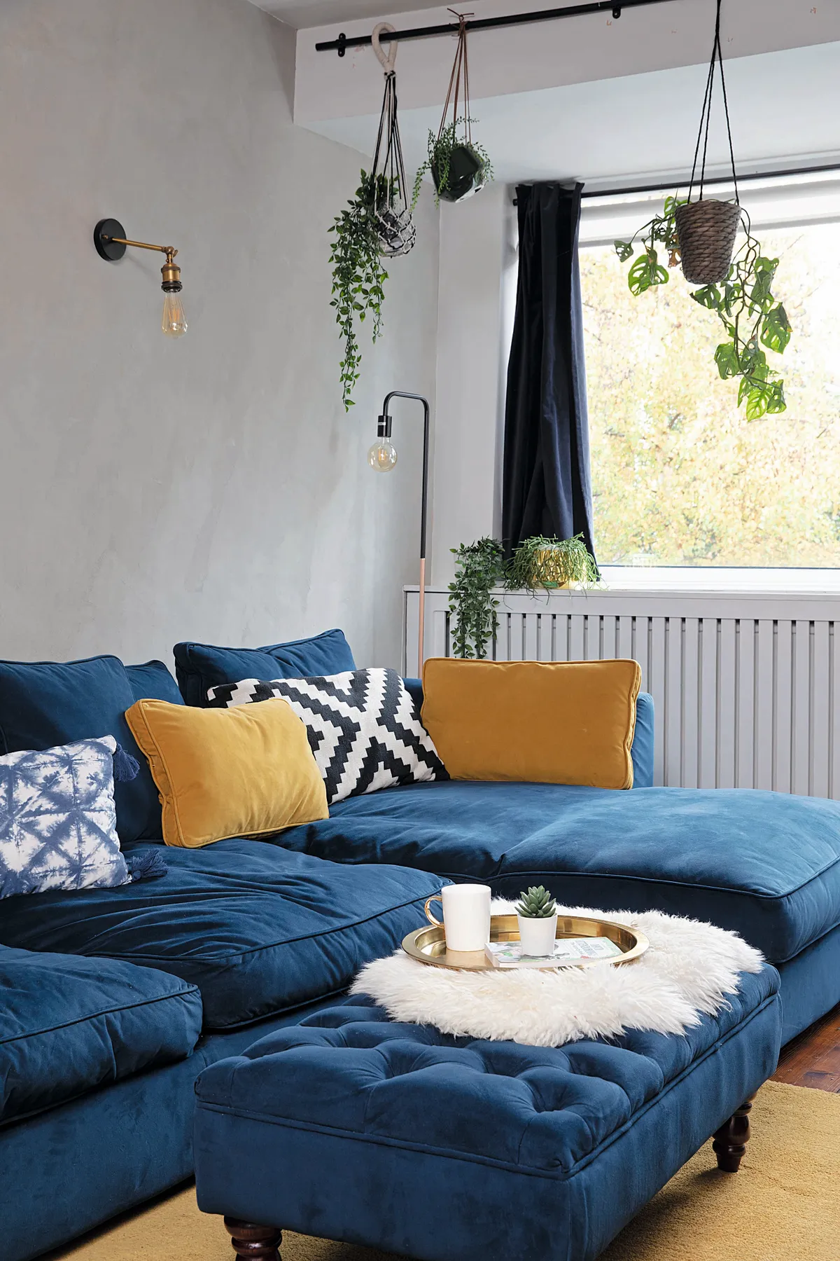
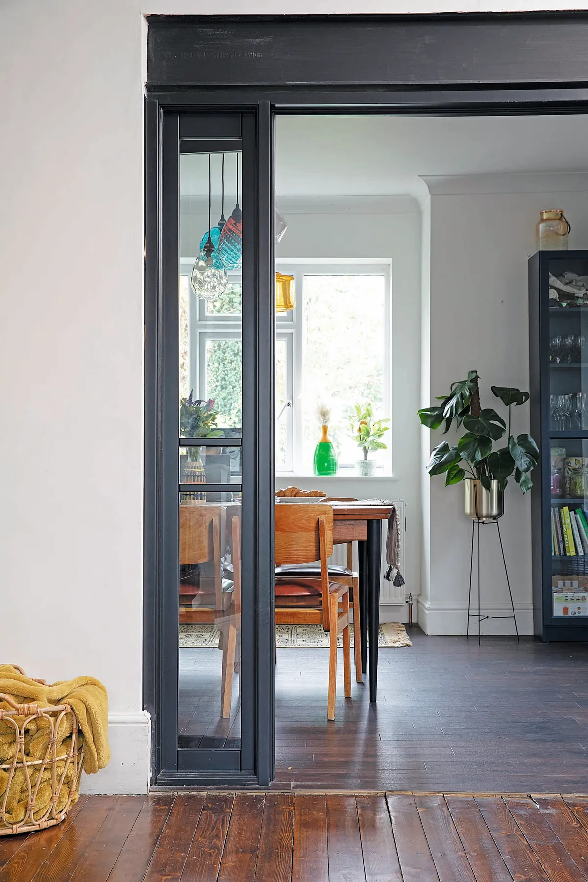
My only regret is not knocking through into the dining room straight away when the kitchen was done. We waited a couple of years to add glazed double doors, but it would’ve been less disruptive to do it all at once. I love the space now and have used similar colours in the soft furnishings to link it with the kitchen and diner.
Dining area
David wanted more of a modern vintage look in here, so we got rid of our heavy industrial table, which had metal legs and a scaffold board top. Luckily, we found a great vintage table for £30 on eBay.

I’ve painted the legs and we’re going to get it dipped and varnished as it’s a bit marked. We also found eight chairs for £100 at Cheshire Antique & Salvage Fair, which I plan to get reupholstered.
Kitchen
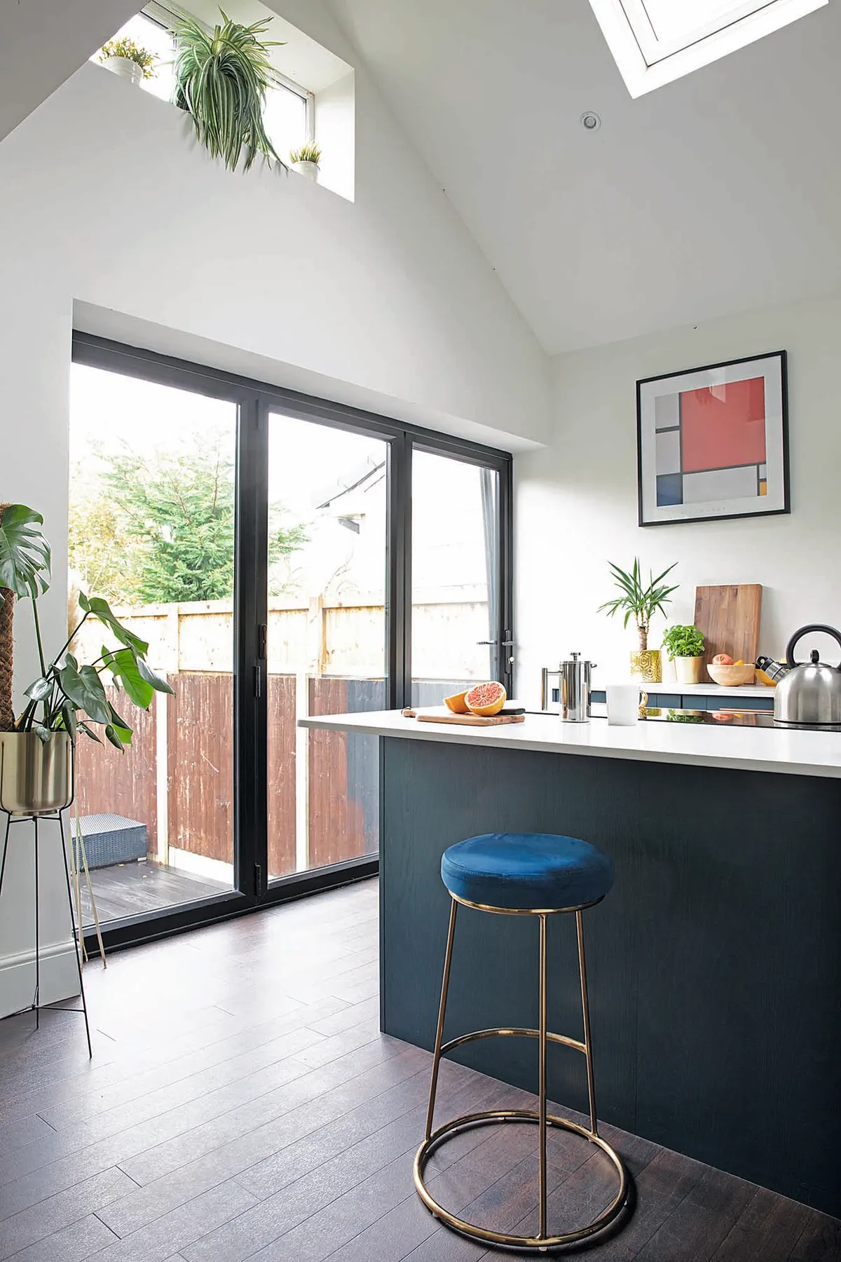
We wanted to keep the walls white in here to bounce the light around, so we opted for coloured cabinets from Salford Kitchens. I chose navy blue to link with our corner sofa in the living room and I’ve added colour through the artwork and shelf display.
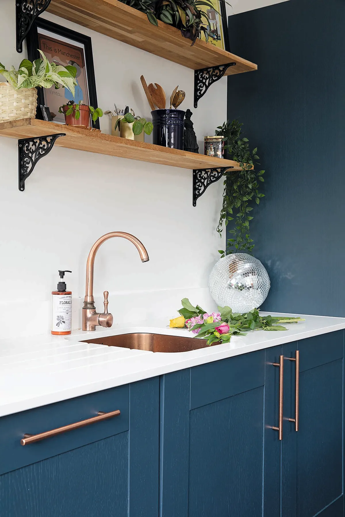
Although we originally wanted a polished concrete floor, it would’ve needed underfloor heating and been too expensive. In the end, we picked LVT flooring from Polyflor, which has the same tone as the stained floorboards in the living room and works with the navy units too.
Master bedroom
Some people like a light and airy bedroom, but I like it to be dark and cosy. After all, I’m never in there during the daytime to appreciate the light.
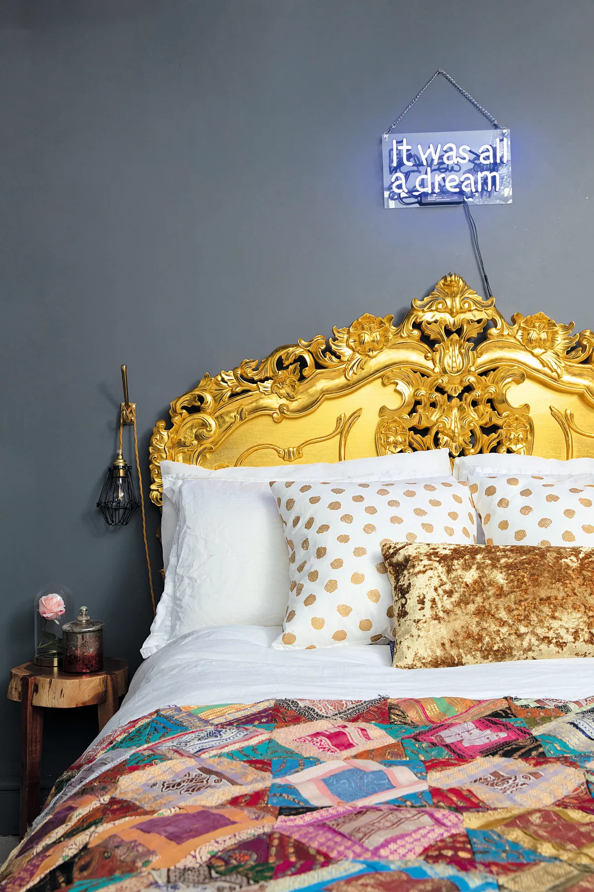
Our centrepiece bed was just £200 on eBay – it’s a wooden design sprayed gold. We’d both been hunting on our laptops for ages as I wanted something bold that would pop against the dark walls. Painting the ceilings dark as well has made the room feel a lot taller as your eye continues upwards.
Bathroom
I had been planning the bathroom design for ages and always imagined an orange bath with dark painted Anaglypta wallpaper and panelling. Luckily, David had some time off work during lockdown to get it done.
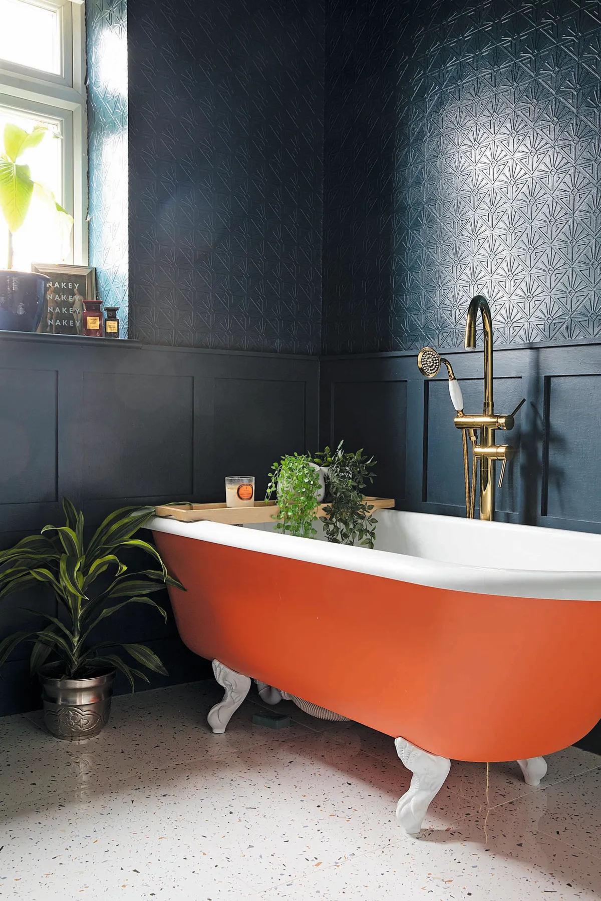
Choosing flooring was the hardest part. I didn’t want plain white tiles or anything too busy as there was lots going on elsewhere. In the end I picked terrazzo floor tiles from Tiles Direct with speckles that pick out the orange colour of the bath.
Guest bedroom
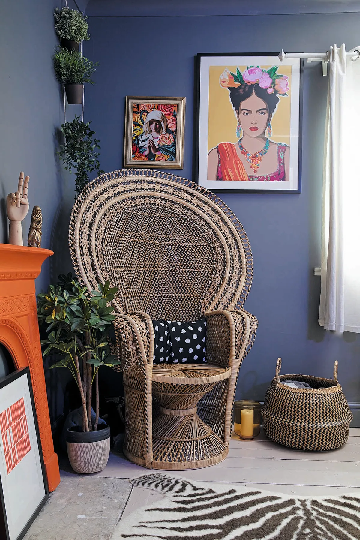
This room doesn’t get much light, so rather than work against it I opted for a dark, opulent feel. I really wanted to use the two vintage emperor and empress scrolls David got on a business trip to Hong Kong.

That led to bamboo and rattan furniture with dark brown walls and gold wallpaper on the ceiling and sliding door. I love it now that it’s gone from drab to fab.
What I learned...
- Although paint can be easily changed, take your time with bathrooms and kitchens. We rushed the basement rooms, so ended up hating the fully tiled wet room, which will be expensive to change.
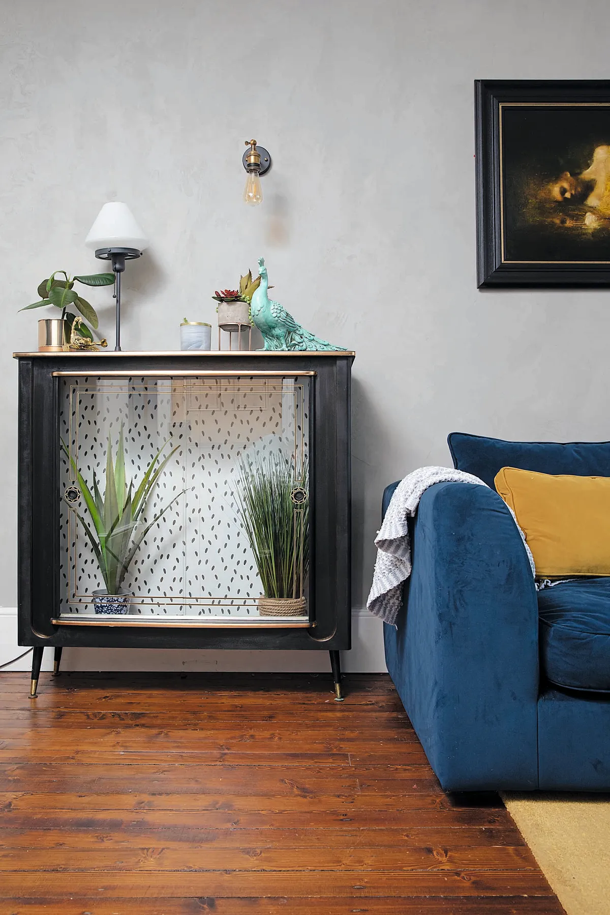
- Upcycle charity shop furniture where you can. You can make a statement piece out of an old unit with a bit of wallpaper découpage.
- I love Farrow & Ball’s dramatic colours but their paint is very expensive. I like to colour-match to Johnstone’s Paint as it’s good quality and the match is always spot on
This is a digital version of a feature that originally appeared in HomeStyle magazine. For more inspirational home ideas, why not subscribe today?
