Interiors influencer Steph Kaluza’s pretty new-build apartment is bursting with personality, thanks to clever DIY tweaks and a dreamy pastel colour palette
I’m Steph Kaluza, 24, a social media content creator, @stephkaluza, and I live with my boyfriend, Jason, also 24, a Twitch streamer.
Where I live… My home is a one-bedroom new-build apartment in a 13-storey block in northwest London, which we moved into in November 2020.
How I made it my own… Buying statement pieces such as my pink sofa, covering up tiles with stick-on vinyl, zoning areas, like the dining space, and adding subtle colour and texture.
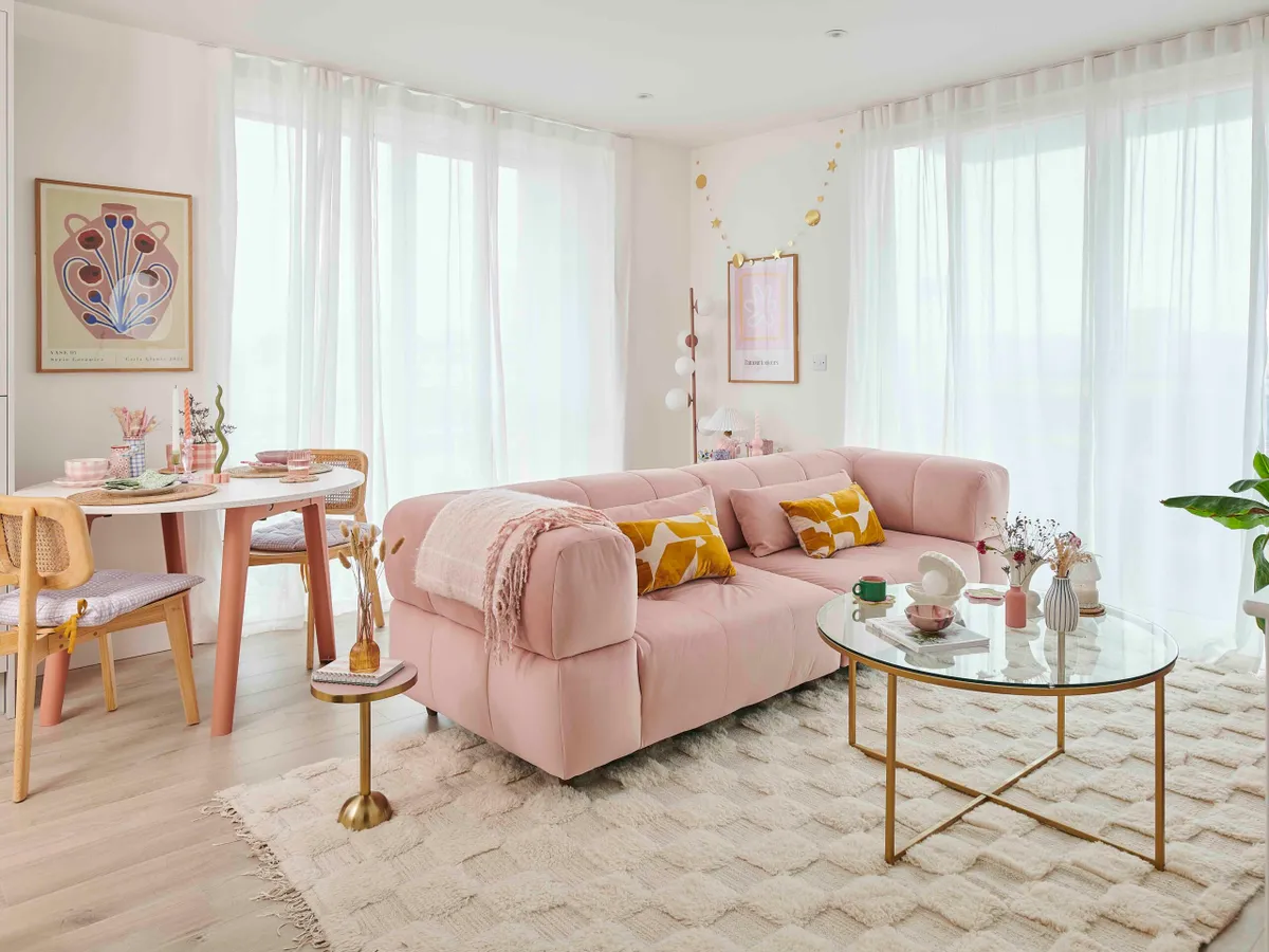
My favourite part… It’s got to be the living area. It’s a lovely, big space and so light. Although we’ve bought the apartment now after renting it, we’re going to keep the walls in here white, even though we could paint them if we wanted.

My boyfriend and I are both from Oxfordshire, but moved to London for work. I studied digital marketing then came to work for homeware brand Sass & Belle and got more and more interested in interiors. I started off in a flatshare, but after a while we found this unfurnished new-build property to rent together. It’s part of the government Rent to Buy scheme and is a lovely light flat with big windows, a cute balcony and great views over London.
After two years of renting, under the scheme we were given the opportunity to buy, and we could choose a percentage rather than pay the full price. We thought a lot about it, and we weren’t sure because it only has one bedroom, but we decided to go ahead in December 2022 and buy a large chunk.
My Instagram, @stephkaluza, has always been about making the most of rental properties, and renter-friendly hacks – but now we’ve bought, I’m going to stick with it, rather than change the name.
When we moved in, we had the basic neutral kitchen, bathroom and flooring, but that was it. It looks very different now. We weren’t allowed to paint the walls before, and everything was bright white, but I’m thinking of adding some soft pinks and greens, particularly to the bathroom and bedroom, but leaving the open-plan living area white. We love our apartment and we’re in no hurry to move.’
How we designed the living area

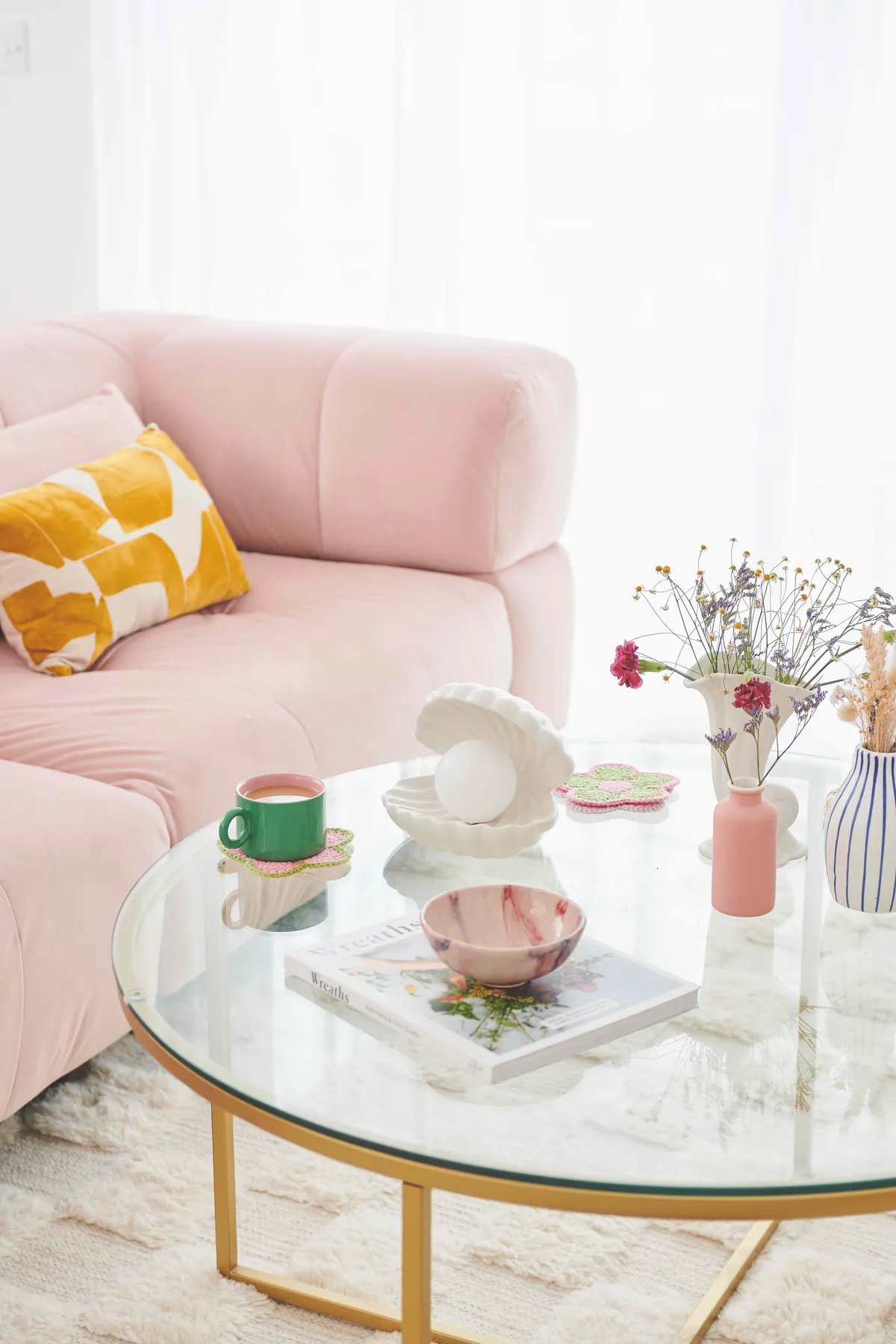
‘The living area is lovely and light, with two huge picture windows and a balcony. We have floaty curtains for the windows – we’re not really overlooked, but it makes it feel cosy at night. I like to zone spaces, and it made sense for the sofa area to be between the two windows with a rug and a coffee table. The sofa was key to the new scheme. We’d moved with our old green sofa, but it wasn’t quite right. I found this fabulous large pink velvet sofa and could immediately tell it would work in the space. I’m one for subtle colours rather than huge blocks of bright colour. I’ve added in yellows, sage greens, and pale rust shades to the scheme, as well as plenty of artwork and unusual accessories to personalise the space.’
Dining area design

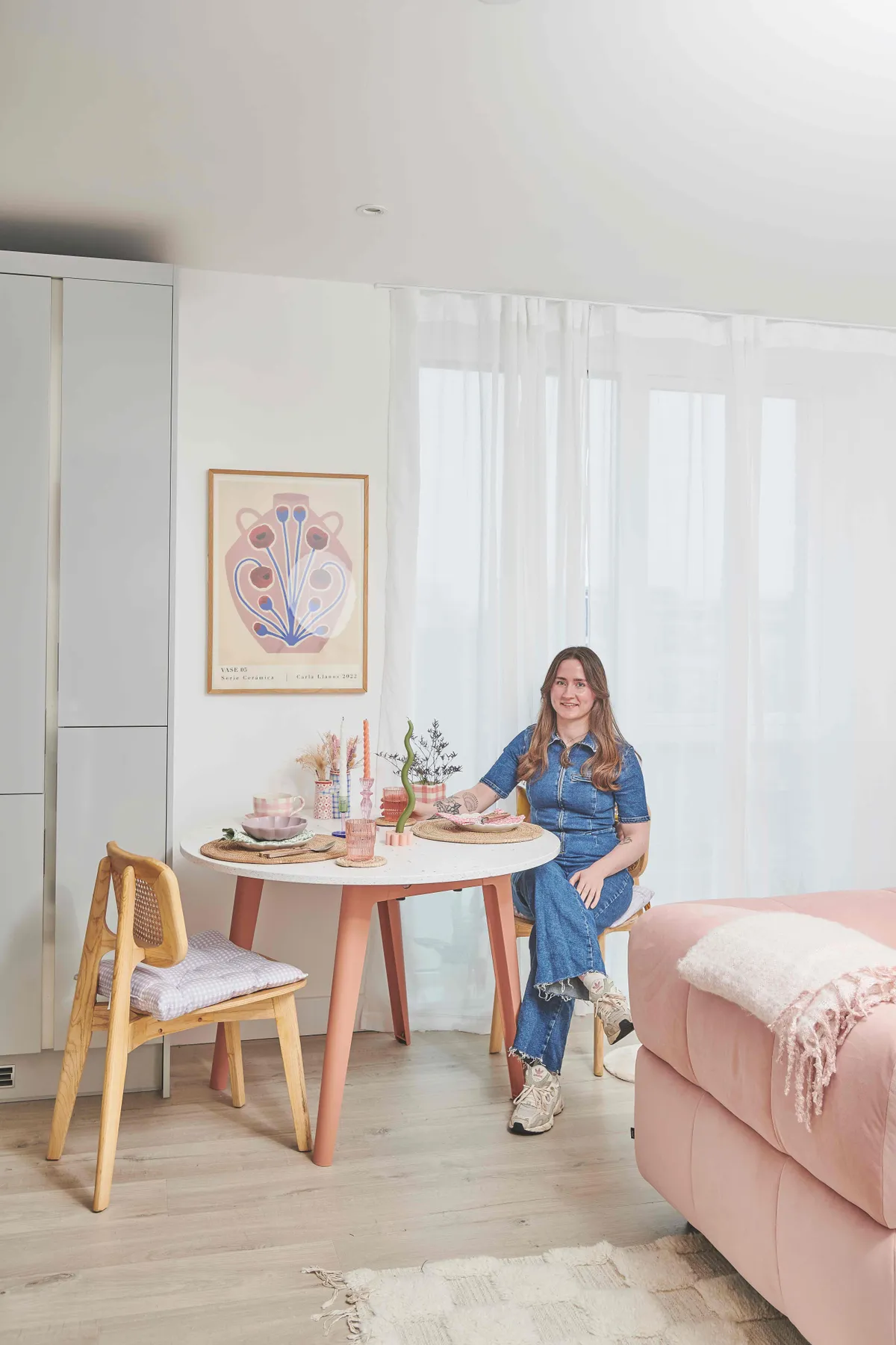
‘I’ve created a separate dining area where we eat most of our meals. I thought about placing the table and chairs in a few different spots before deciding on this layout, but it made sense to place it next to the righthand side of the kitchen, so the food could just be carried across. It’s by the floor-to-ceiling kitchen unit, where all the crockery and cutlery is, so it’s quick to lay the table. We usually just have it set for two, but it can be easily pulled out and other chairs added if we have friends over. It’s also next to one of the large picture windows so it gets plenty of light. We do have a balcony with chairs out there, so if the weather’s warm we can just move from one to the other. To ground the dining space, I’ve hung a large print above the table in some of my favourite accent colours.’
The main bedroom

‘It’s not huge, but there’s room for everything we need. We bought a new bed with a rattan headboard, and now that I’ve discovered linen bedding, I’ll never go back. My set in pale pink linen is a great base to layer up with cushions and throws. I’ve added some subtle, pared-back green touches as well, because pink and green is such a good combination. I even found a metal bedside table in sage, and a plywood storage unit for the end of the bed which add two more textures to the room. I’ve also echoed the cane headboard with my radiator cover. All the covers in the flat were originally from B&Q and I’ve removed the panels and replaced them with rattan cane webbing, which looks a lot better.’
How we decorated the bathroom

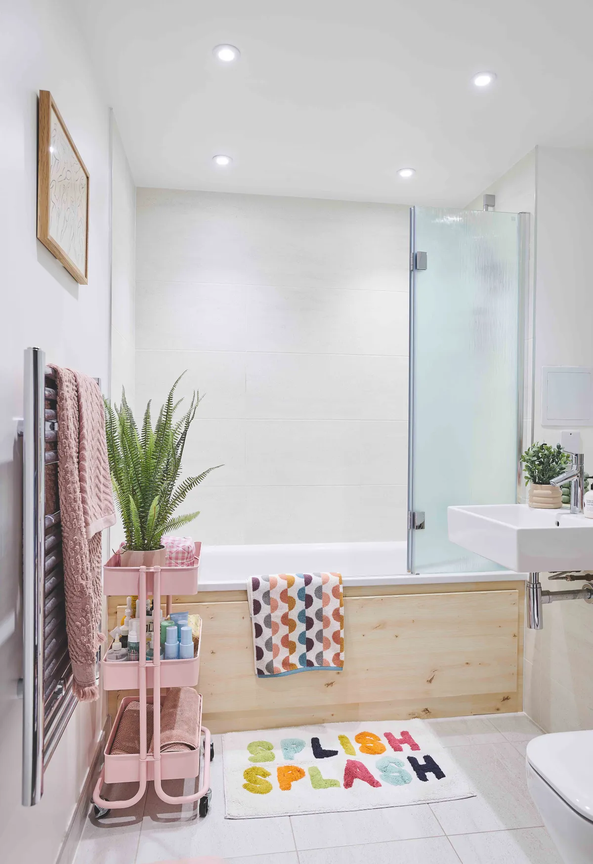
There wasn’t a lot we could do with the layout of the bathroom, which was already installed, but the basic white suite and neutral tiles were fine. As we were renting for the first two years, we couldn’t paint the walls, but I used a trick to make it look like we’d added a wooden side panel to the bath to give it some character. It’s actually a wood-effect vinyl, but it’s very realistic. I also found a great free-standing unit, in pink of course, which holds all of our toiletries. I’ve added plenty of accessories and towels in pinks and yellows, along with a lively bathmat. Now we own the flat, we’ve got lots of plans for the bathroom. We’re definitely going to put a lot more pink in here, and see if we can paint the floor tiles.
Words Stephanie Smith, Photos Olly Gordon, Styling Emma Fishman
