Since its inception in the 1950s, the mid-century modern aesthetic has been one of the most popular interior design styles. Directly influenced by the modernist movement of the early 20th-century, the mid-century modern interior is centred on form and functionality, typically made up of sleek wooden furniture, long clean lines and open-plan living.
If you're looking for ways of adding character to a new-build house, or fancy refreshing a period property, or maybe just want to tap into a couple of the key trends of a mid-century modern interior, then look no further. Our interior guide will break down all the essentials to achieving an authentic-looking mid-century modern home. But before we begin, let's explain a little bit about the history of mid-century modern design...
What is mid-century modern design?
The term 'mid-century modern' was coined in the 1980s by author Cara Greenberg, who titled her 1984 book ‘Mid-century Modern: Furniture of the 1950s’. This design style was especially prevalent in America in the 1950s and 1960s. During the 1930s and 1940s, many European architects and designers migrated to the US to seek a better life after the turmoil of the Second World War. With them, they brought many new ideas for art, architecture and interior design which would subsequently become a cornerstone for the mid-century modernist movement.
The Noguchi table created in 1947 and the Eames Lounge chair created in 1956 are two prime examples of mid-century modern design, but their sale prices made them out of reach for most people. From the fifties onwards, however, mass production was on the rise. More and more companies sprang up, imitating the popular styles created by imminent modernist designers such as Charles and Ray Eames and Isamu Noguchi. This era of mass production made furniture easier and quicker to acquire and cheaper to buy too. Now, more people than ever could achieve a stylish interior.
Classic mid-century home ideas
How about the stylistic features of the mid-century home? From the distinctive colour scheme and use of creative furniture and open-plan living, these pointers will help you achieve the classic mid-century modern style at home.
Mid-century colour scheme
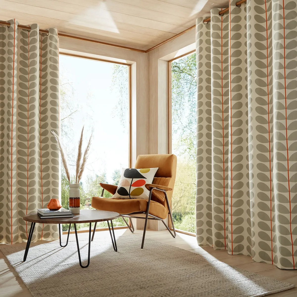
Orange and brown were the most popular shades in mid-century modern design; they created a warm, earthy interior that complemented the wooden furniture. Occasional pops of contrasting colours such as coral, as shown in the example above, kept rooms light and fresh.
If you're not sure about going all out with the orange and brown look at home, try adding accent items in these shades, like an orange lampshade or armchair, against a white background.
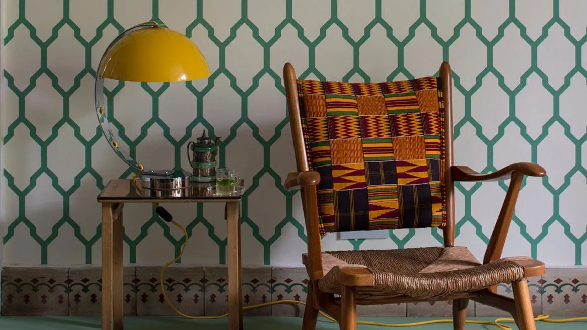
Speaking of white, this was another popular choice for mid-century modern homes. By keeping walls white, wooden furniture really stood out and made a house feel lighter and larger.
Modern interpretations of mid-century design include a far greater range of colours than just orange, brown and white though. Feel free to experiment with different shades, but be sure to keep your colour palette minimal, with no more than two or three shades in each room and make sure the colours complement wooden furniture.
Mid-century furniture
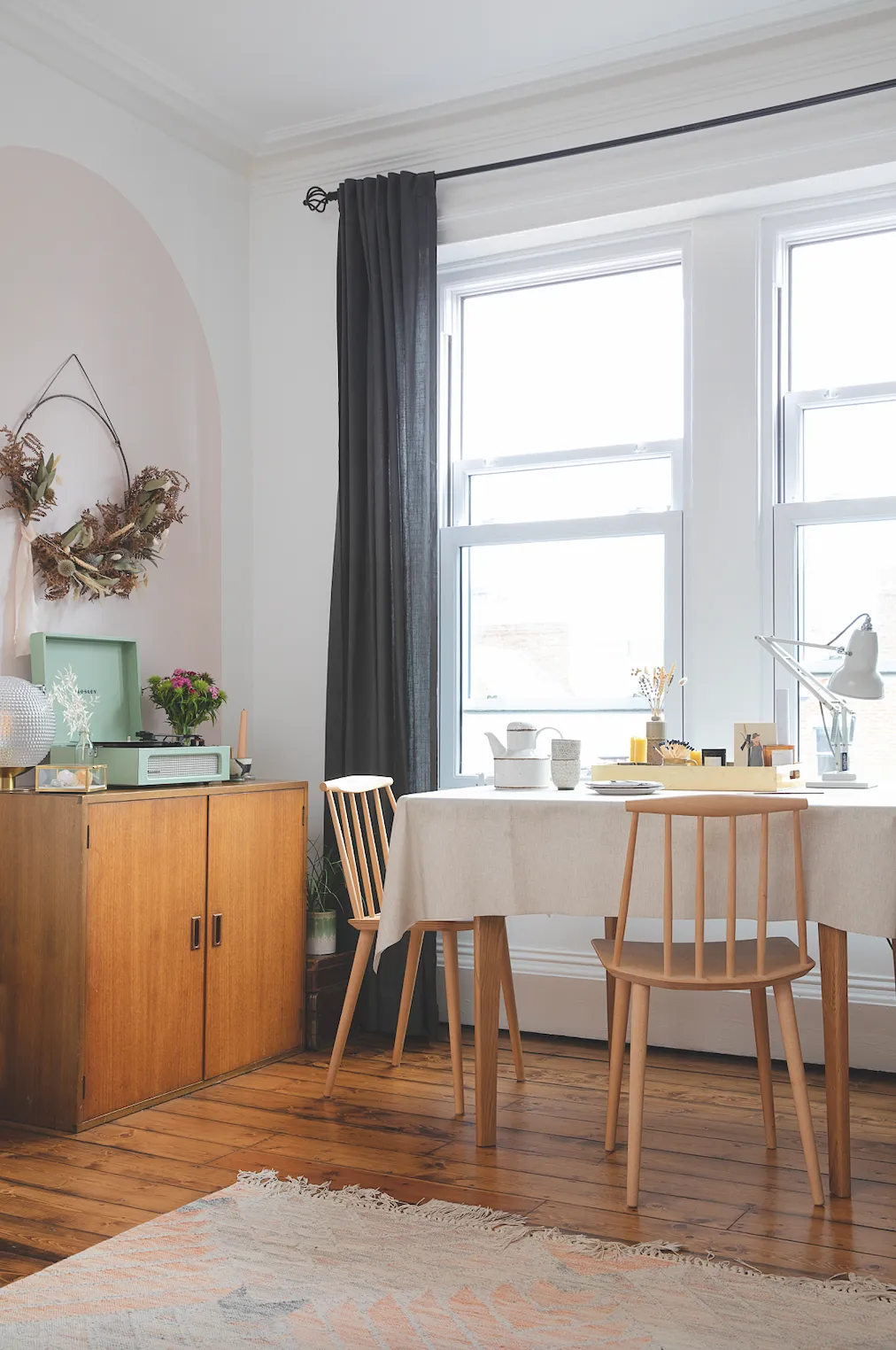
Mid-century furniture is typically slimline with minimal ornamentation, with a big focus on wooden textures. Sideboards, cabinets, chairs and sofas are all usually quite low to the floor, with slim legs to give a floating appearance. This makes a room feel less cramped and gives the illusion of height.
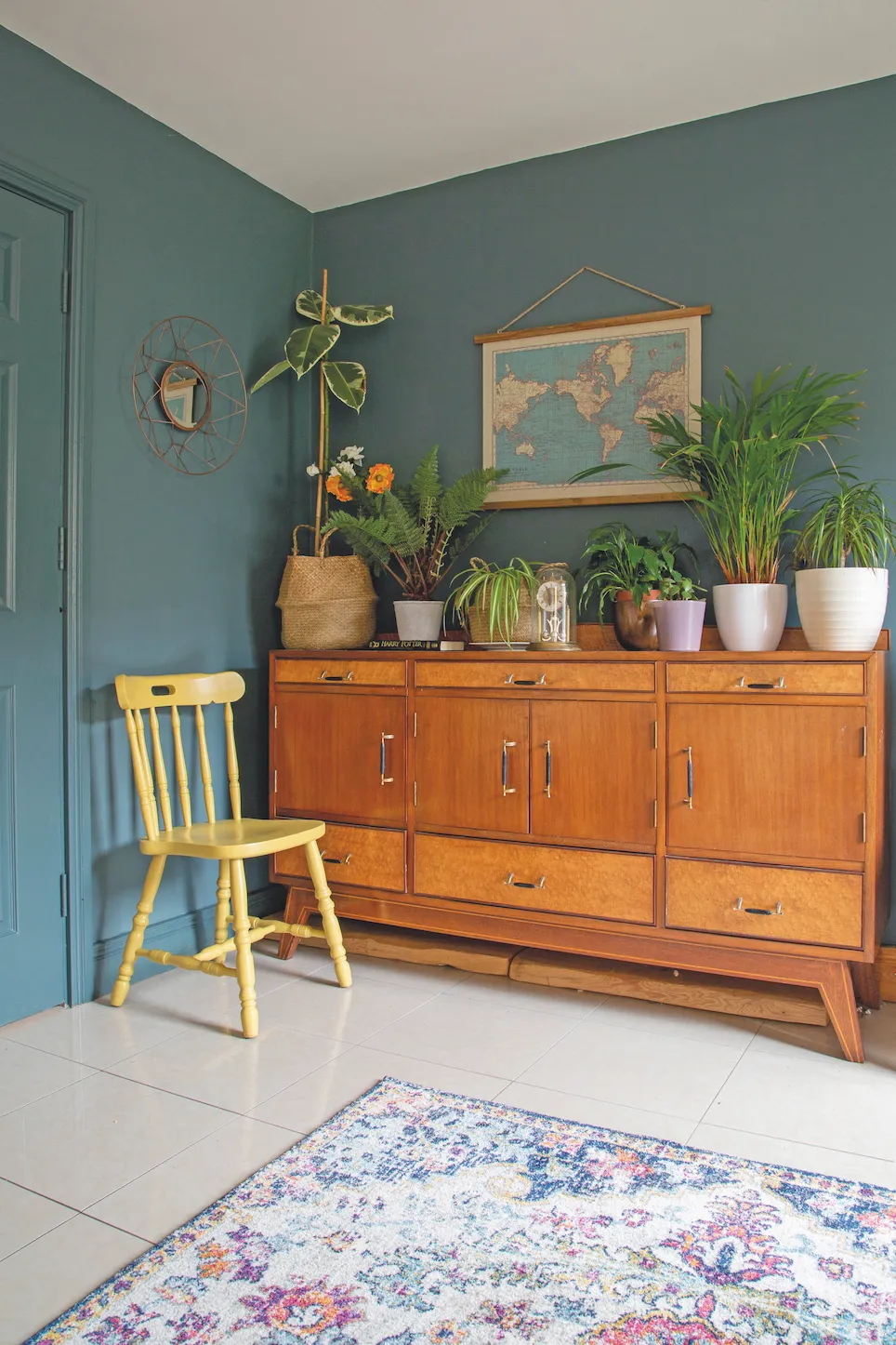
The compact nature of mid-century furniture means you can use them in a range of rooms and house styles; they work well in new-build houses, which are often tight on space, as well as period houses which often feature lots of tricky nooks and crannies.
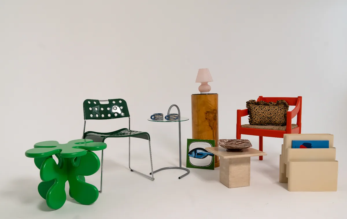
Facebook Marketplace, Gumtree, Freecycle and Narchie are all great websites to try if you're on the hunt for original mid-century furniture. Contemporary brands like La Redoute, West Elm and John Lewis & Partners stock plenty of mid-century-inspired furniture if you'd prefer to buy new instead.
Mid-century living room
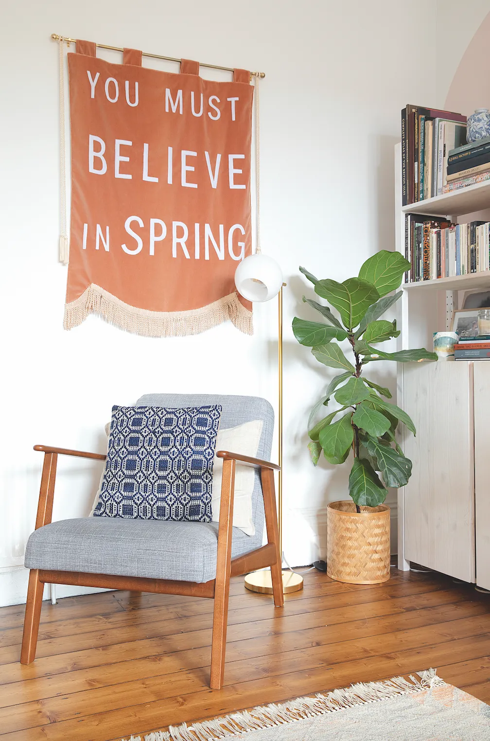
One of the key components of mid-century modern interiors is a focus on furniture and architecture over decorative ornaments and patterns. The modernist outlook is that good furniture and interior architecture is all the decoration you need - say goodbye to your knick-knacks!
Similar to the Japandi aesthetic - modernists believed you should only have a select few items on display and these items should tie in with the rest of the interior scheme rather than stand out from it. Surfaces should be kept clean so the furniture can take centre stage, and wall art should be kept minimal so as to not distract from the room as a whole.
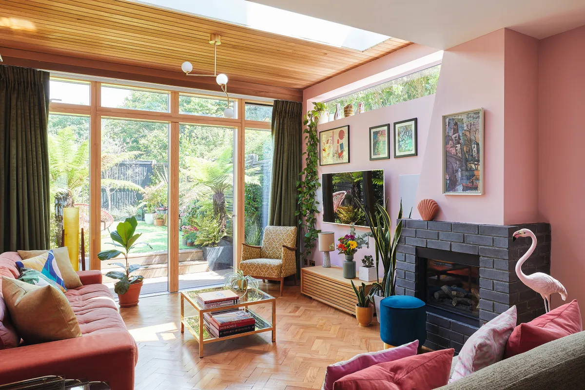
In the last few years though, a more contemporary approach to the mid-century trend has meant that more ostentatious decorative items, artworks and patterns have intertwined themselves with the previously minimal, modernist aesthetic.
Colourful walls, like Bo's millennial pink walls above, and quirky Instagrammable accessories look great paired with the classic mid-century furnishings, creating in a way, a whole new interior style.
Mid-century kitchen
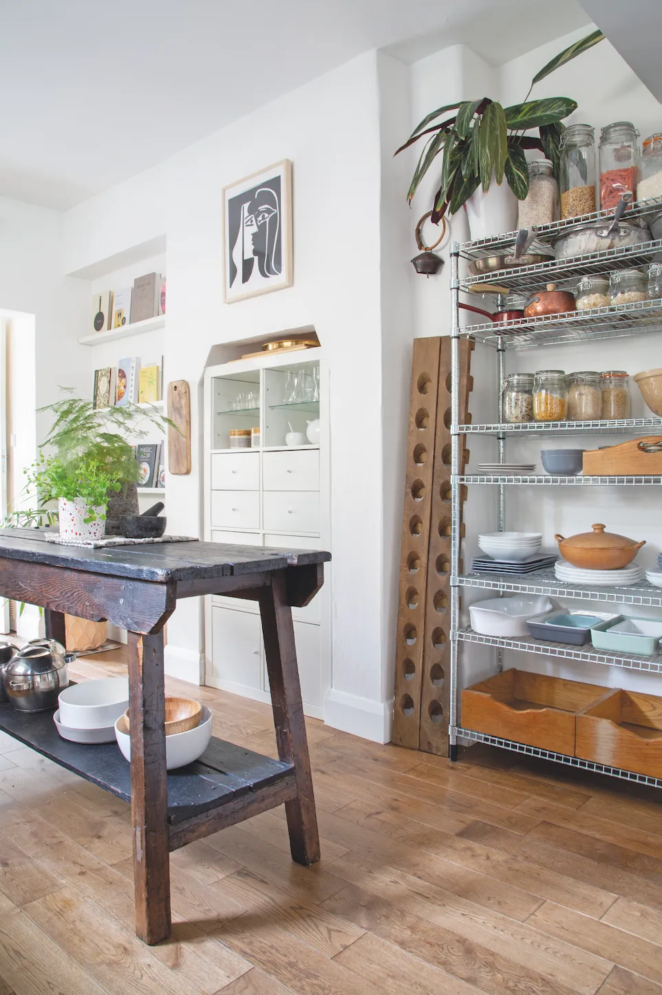
A classic mid-century modern kitchen is highly functional, often with smart, fitted storage and space-saving furniture. Open shelving, like the ones shown above, helps to create a sense of extra space and light. Notice the multi-purpose table and island, which help to zone the open-plan room.
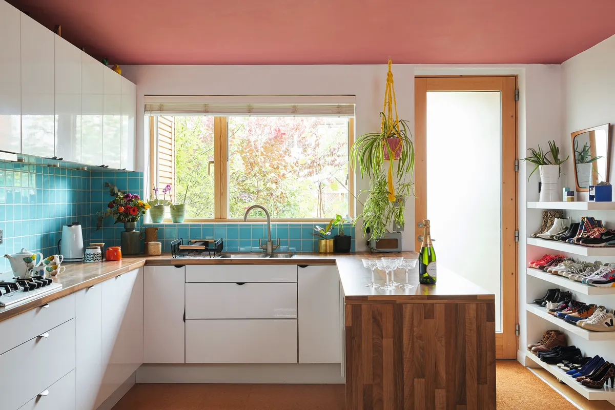
To achieve a mid-century modern kitchen look at home, consider multi-purpose furniture such as an island/bar/table and try and keep your space as open and clutter-free as possible. Keep the colour scheme neutral, to emphasise the functionality of the room, but if you want a pop of colour, try adding one or two statement shades or a bold piece of art.
Mid-century dining room
Want to achieve the mid-century modern look in your dining room? The focus on open-plan living meant kitchen-diners were popular with modernist designers but they still liked to use a few tricks to define the two spaces.
Room dividers, often built into the room structure, helped to create intimacy when dining. These room dividers, or screens, were often slatted so light could still flow through. Creating two levels within a room was another effective zoning technique.
Mid-century bedroom
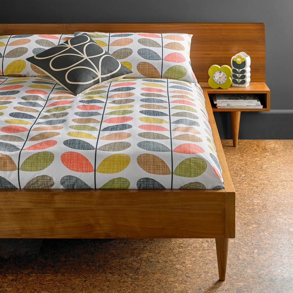
Natural materials, such as wood, are especially pleasing in a bedroom as they help to promote a sense of calm. The same goes for white walls and low furniture, so the bedroom is really a prime room to try out the mid-century aesthetic.
Built-in wardrobes, shelving and storage are some key elements of a classic modernist bedroom, while sleek wooden drawers, minimal bedside tables and a statement light hit the brief for a mid-century interior.
Check out the addition of cork flooring above too - very retro!
Looking for more interior inspiration from history? Check out our style guides to Georgian, Victorian & Edwardian houses!

