Colour is a powerful tool that can completely transform your home, but with so many options to choose from, it’s easy to get overwhelmed.
We called in the Creative Director of Dulux, Marianne Shillingford, to share her top tips for creating your perfect scheme.
How to create a colour palette
Start from the heart
When you begin to put together a palette, Marianne advises to start from the heart. Base the colours in your palette around something in your home that you really love.
‘It could be a great picture, or it could be a beautiful piece of furniture. If you start from a place of something you love, then everything that grows from that is going to be something you like’.
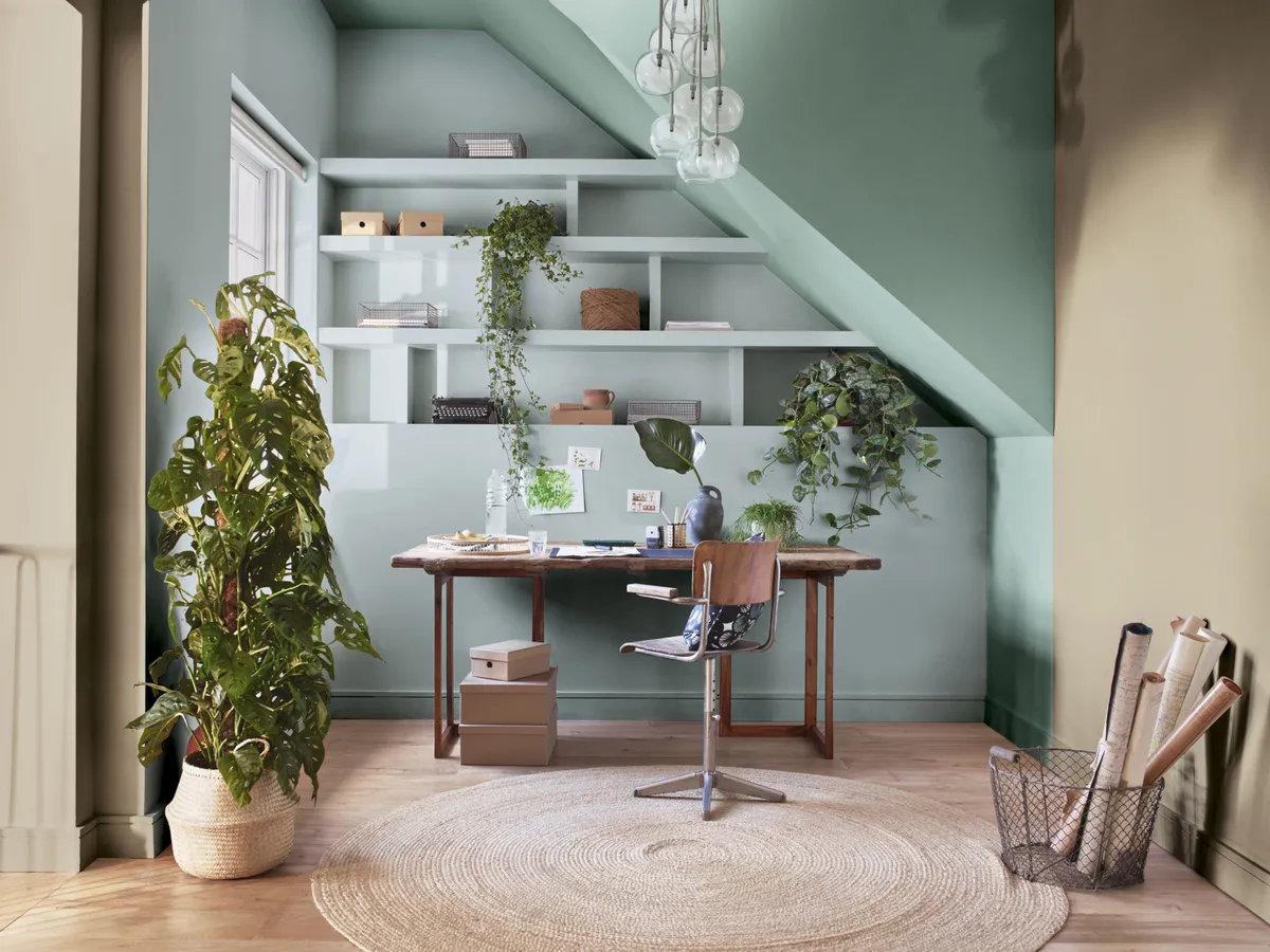
A technique Marianne uses to help her select colours is to squint at the object she’s using for inspiration. As you reduce the detail in what you’re looking at, the brighter colours become clearer. She suggests choosing the colours that jump out at you to create accent pieces in your home.
Visualise your scheme
The Dulux Visualiser app is a tool Marianne uses to find colours that work well together. The app creates palettes from colours you can input with photographs of your favourite things. It will then provide you with palettes that work well together in different ways.
The tonal palette includes tones of the colours you have entered. The contrasting palette gives you colours that are the opposite of this, which will help to add some drama to your schemes. The neutral palette contains softer, calmer colours that go with everything.
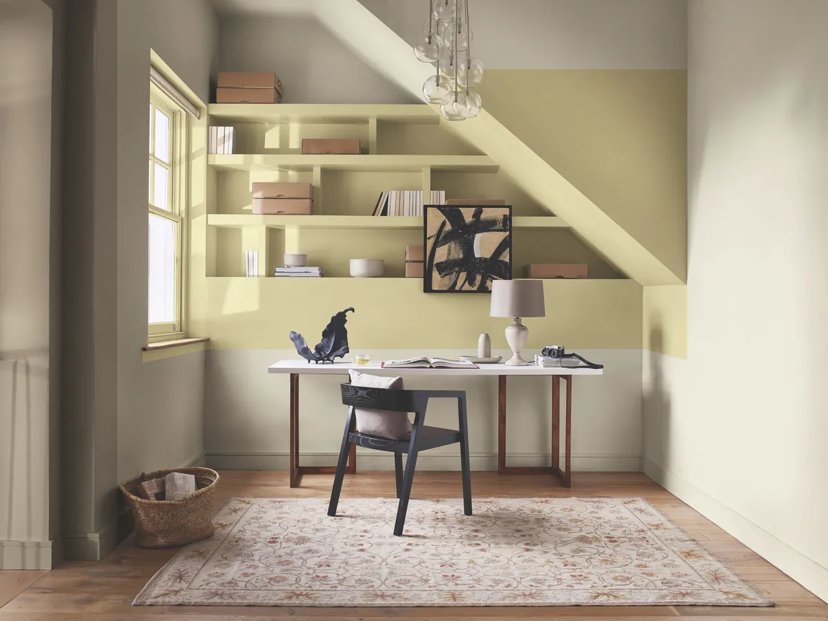
‘Using this app, I instantly have the opportunity to blend this beautiful thing that I love and surround myself with its palette in my home,’ explains Marianne.
You can also use the Dulux website, which has a colour chart to help you select paint colours that match your favourite shade or shades. Pick a colour on the website and you’ll then be able to see lots of different palettes created around it. Marianne recommends ordering testers to help you see how colours look in your space in different lights, and how they make you feel too.
Choose hero and sidekick shades
Understanding how a palette will be weighted is an important part of putting colours together. Marianne recommends starting with three colours and having an image of a colour wheel to hand.
To begin, choose your hero colour. This could be one of the colours you found when you squinted at your object. Now for your hero’s sidekick, this is your supporting colour which will link the rest of the colours in the palette together.
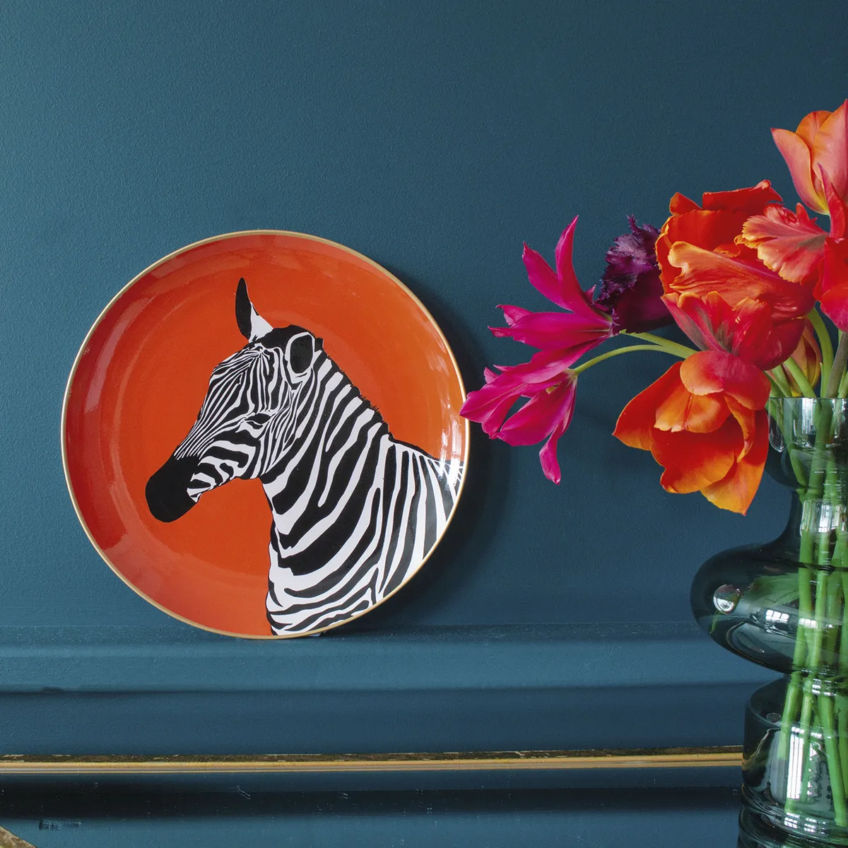
Finally, choose a neutral colour, this could be your wood or carpet colour for instance. Marianne uses Oxford blue, white and stone as an example of a three-colour palette. Once you’ve pinned down three colours you love the look of together, you can expand the palette to five colours. These additional colours can add a bit of excitement to the palette, or simply extend the same feeling.
Completing your palette
Using the Oxford blue, white and stone palette as an example, heading to the opposite side of the colour wheel from your blue hero colour will give you oranges and corals. This pairing of colours is known as ‘complementary’ and will make each colour look brighter. This is a great technique for adding colour pops to your scheme.
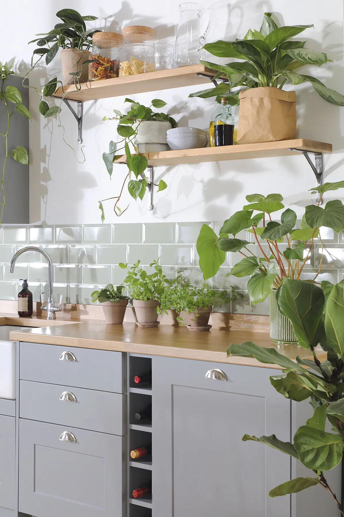
If you look at colours either side of your blue, you’ll find greens and violets. Using these colours with blue will create a ‘harmonious’ pairing, a more relaxing colour scheme. Using more than five colours in your palette can make it difficult to create a coherent look, so Marianne advises sticking to three or five colours for a stylish, pulled-together scheme.
How to use your colour palette
Designing with flow
Once you’ve chosen the colours in your palette, you can start to think about how they’ll be used in your home. Use testers to paint large pieces of paper. Then, you can move them around to see how they might look on the walls, floors or ceilings. Colour can be used to link spaces in your home together.
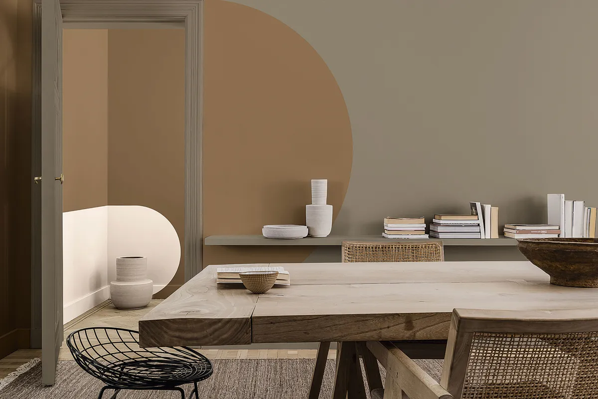
Using one of your neutral or supporting colours across all the woodwork in your communal living areas, for instance, will create a subtle feeling of flow between these rooms.
For a more obvious link, paint a band of one of your stronger colours across all the skirting boards. Marianne says that this works well for open-plan areas or rooms that come off one corridor but suggests that you might want to avoid linking more private spaces, like bedrooms, to communal ones in this way.
Creating zones
Using colour to zone our spaces is a technique Marianne expects lots of us will be embracing over the next year. Our homes have been working harder than ever, and the past year has taught many of us how to do more with less. Not only are our homes becoming smaller, we’ve needed them to act as school rooms and home offices too.
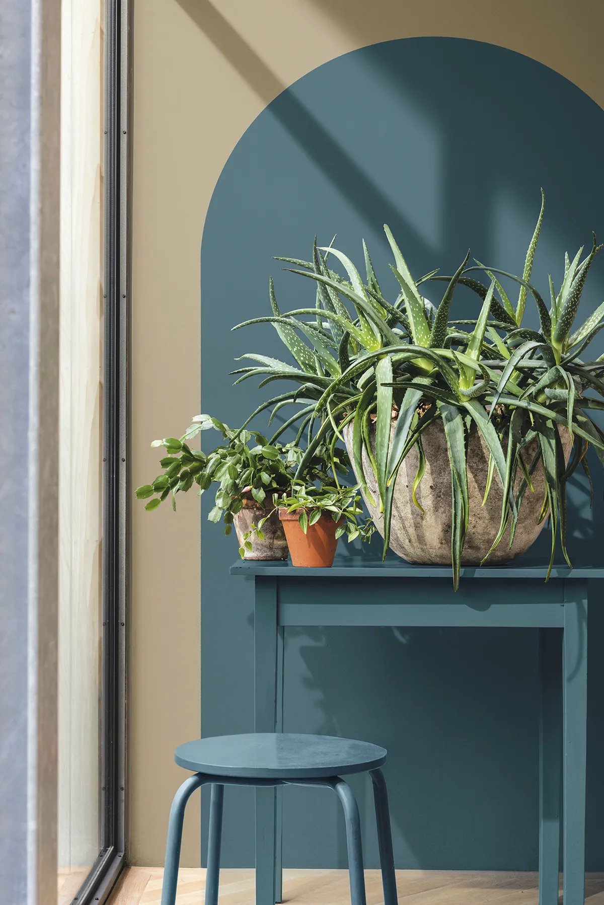
She suggests using blocks of colour to carve out spaces for specific activities. ‘Take an open-plan space and create a charming corner, with a colour going up onto the ceiling. You can use the colour on the ceiling to help define that particular place where you sit and read a book or just watch TV’.
Colours to use with caution
Although there are no taboo colours when it comes to decorating, Marianne advises us to think carefully when using bright yellow and red. ‘Yellow is a bit like a big bumblebee, that’s the impact that it has on a room. It’s full of dynamic energy, but equally it can sting’.
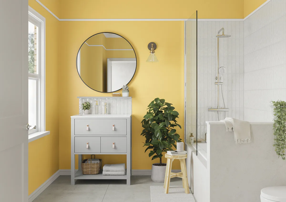
As an energising colour, a bright yellow bathroom could be just what you need to give you a spring in your step in the morning, but it might be too stimulating for a child’s bedroom.
Red is another colour that can be tricky to work with. Its fiery tones remind us of passion so it can be perfect for intimate spaces. However, it’s such a strong colour that it can feel overpowering for some.
Calming vs. energising colours
Deciding where to use each of the colours from your palette can be an ‘emotional’ as well as an aesthetic choice. Marianne recommends choosing colours based on how you want the room to feel.
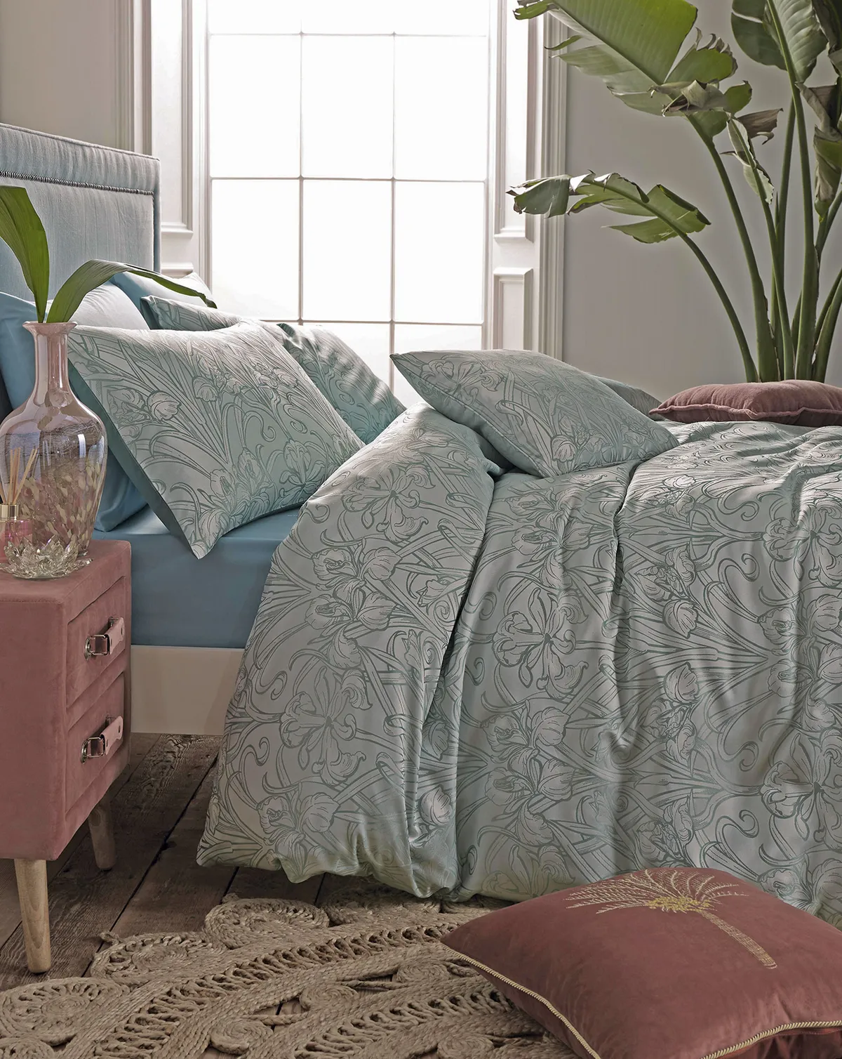
‘I don’t sleep very well so I’ve got a bedroom that’s really tranquil,’ she explains. ‘The rest of my home is like a carnival! But my bedroom is where I go to unwind because that’s what I need.
‘In a teenager’s bedroom, or for somebody who needs a bit more get-up-and-go in the morning, you might have something completely different. You could use a colour that energises them.’
For more paint colour inspiration, check out our guide to the colours to watch in 2021 and Farrow & Ball's palettes for 2021.

