Sarah and Phil were recently engaged and planning to move back to their hometown of Leeds when saw their home for the first time.
It was within walking distance from parks and the city centre, and they had a good feeling about it from the moment they walked in.
Here, Sarah shares her renovation story...
My story...
As soon as we saw this house, we fell in love with the potential it had, and we knew we could put our own signature on it.
I’d definitely recommend going with your gut feeling when looking for your future home. We had seen so many places that just didn’t feel right and I’m glad we didn’t rush into anything.
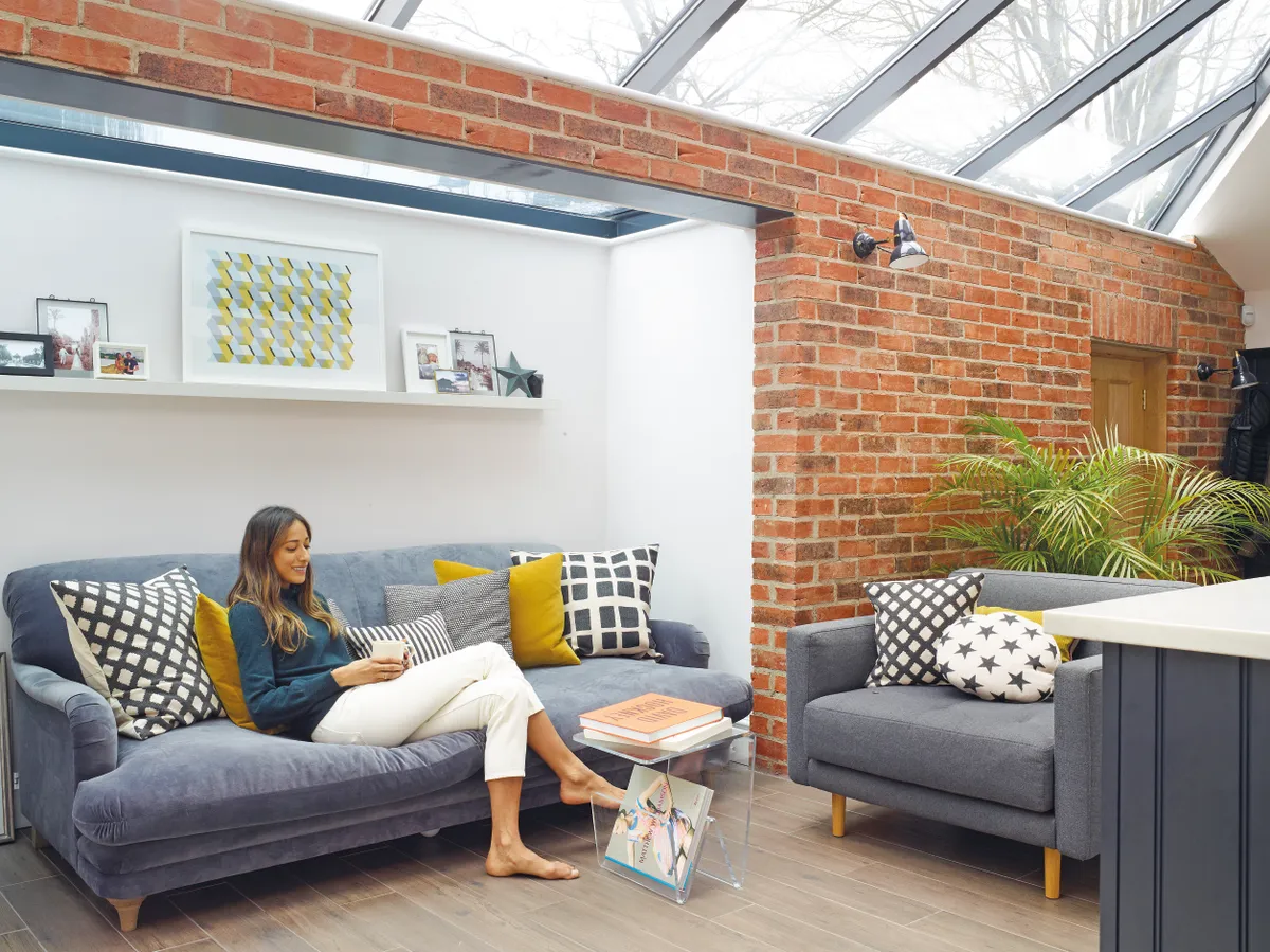
The first thing we did was to change the magnolia walls and carpets to a more muted palette, and we also reconfigured the loft room to create a larger en suite bathroom and master bedroom.
Welcome to my home
A bit about me I’m Sarah and I’m the wellness director at Boots in Nottingham. I live with my husband, Phil, and our son, Theo, who is two years old.
Where I live Our house is a five-bedroom Edwardian townhouse in the leafy Park Estate in Nottingham. We’ve lived here since 2014.
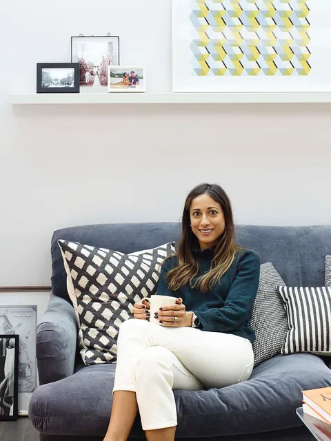
We left the kitchen area as we wanted to live in the house for a while before making the big changes to make sure we got them right. We spent six months drawing up plans and a further year getting the permissions that we needed.
The building work to create the new open-plan kitchen-diner, utility area and garages took another six months.
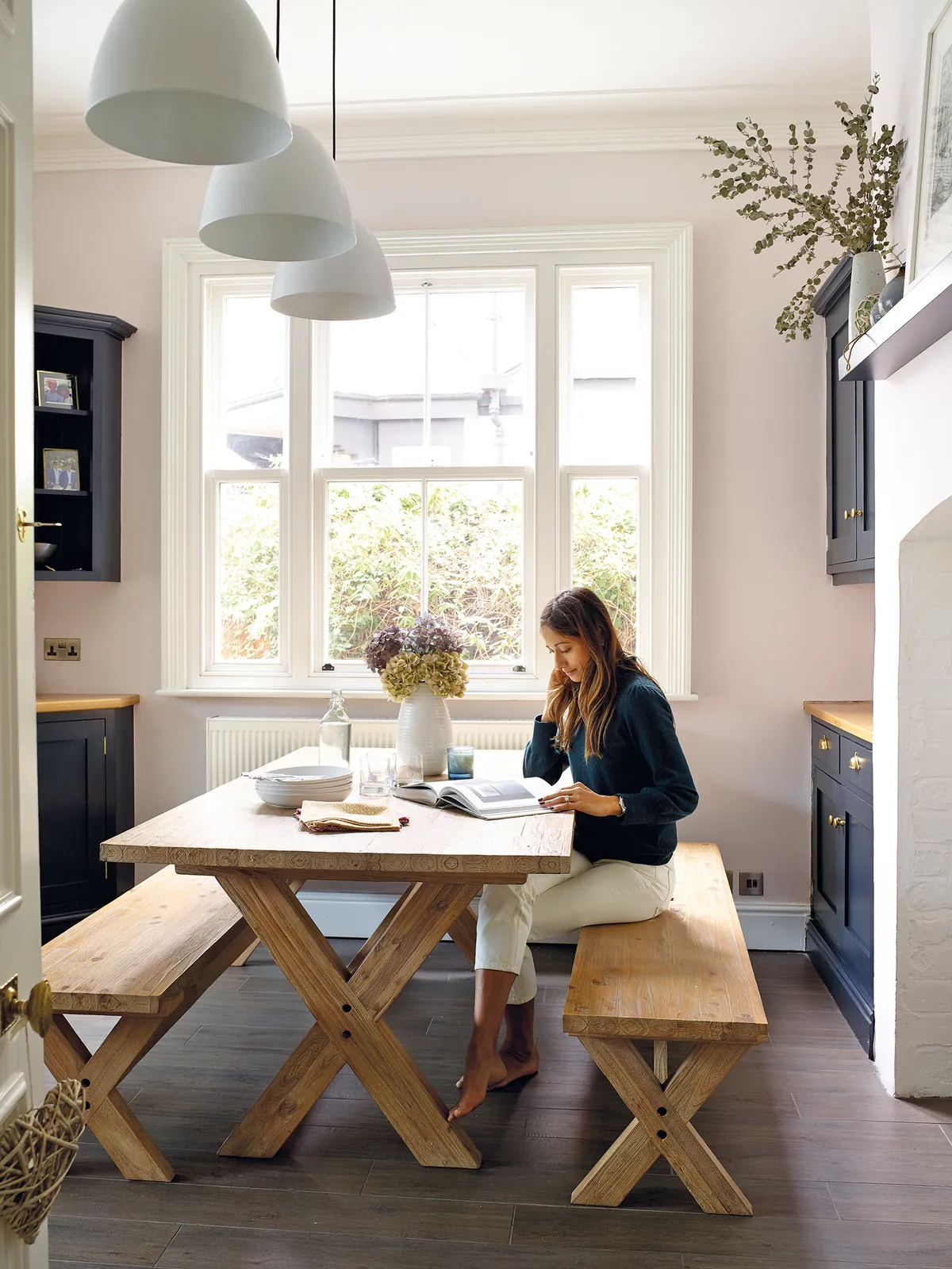
We mostly went for neutral colours, but then there are some really strong shades throughout the scheme too. For inspiration, I looked to Pinterest and magazines, and also developed a bit of an addiction to Instagram!
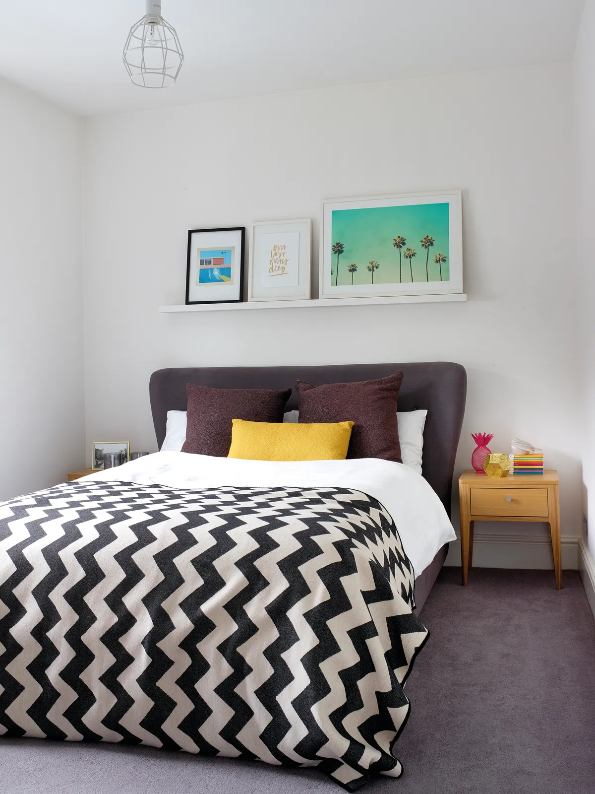
Through doing this project I’ve definitely developed a love for interiors and, left to my own devices and with an unlimited budget, I’d probably start refreshing all the rooms.
More about my home...
What I wanted to change The décor was dated, and we needed to knock the kitchen through to the garages and create a bigger living space downstairs.
How I made it my own We repainted the rooms, recarpeted the hall and retiled the bathroom. We also created a new kitchen area and larger bedroom/bathroom space upstairs.
My favourite part Our double-height ceilings and doors. They create a wonderful sense of space.

We do love the house and are so happy here, but in the future our dream would be to buy a piece of land and build from scratch. Even though it’s completely different from this, a minimal barn conversion in the countryside would be the ultimate project for us!
Kitchen-diner
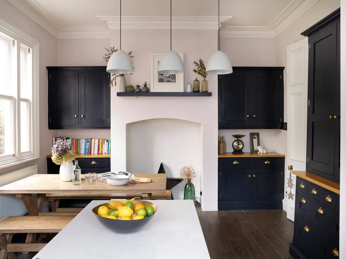
After completely gutting this room, then knocking it through into the garage and putting in a new kitchen, this space has been transformed.
A bright, modern vibe has been achieved by contrasting a pared-back wooden dining table and stools against dramatic dark cabinetry.
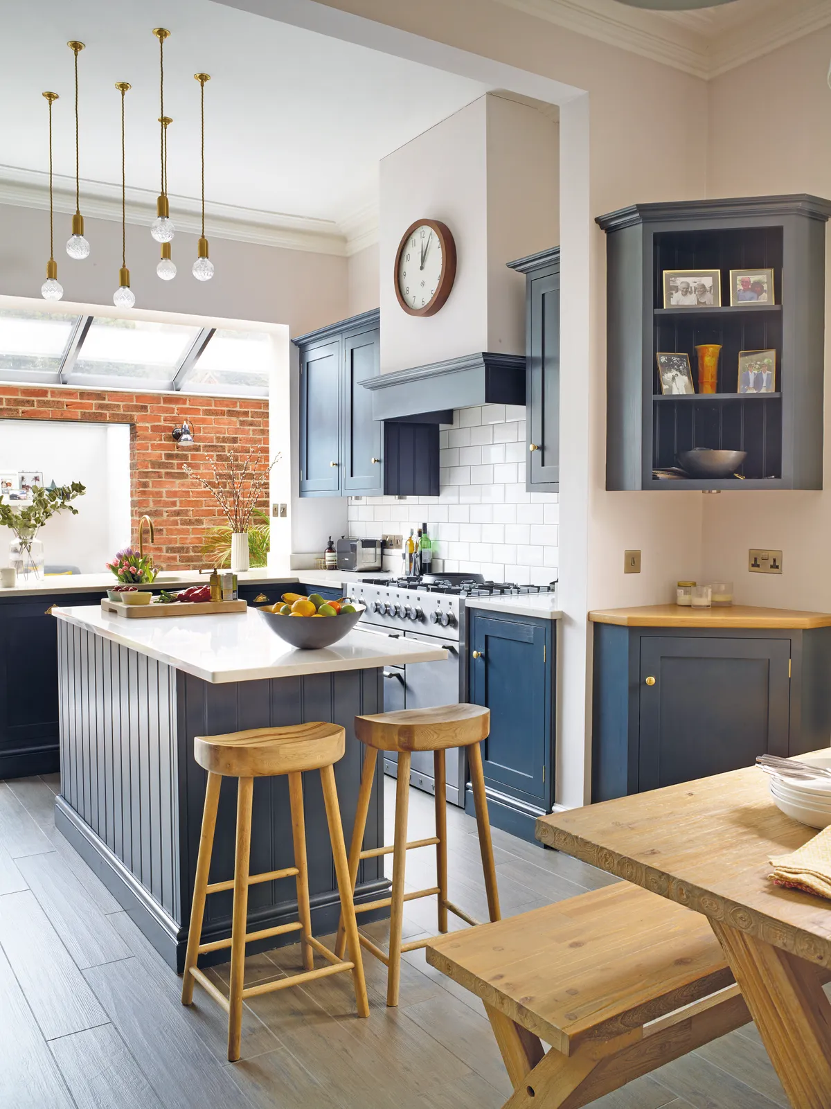
An exposed red-brick wall at the far end of the island adds to the effect and frames the small snug space. The bespoke kitchen cabinets are painted in Farrow & Ball Railings and designer lighting by Lee Broom hangs above the island.
‘This is my favourite room in the house,’ says Sarah. ‘I love the high ceiling and the space it gives, and I think the lights really bring this height to life.’
Living room
With its original fireplace, cornicing and calming grey walls, the living room has a classical feel. ‘We fell in love with the beautiful Edwardian detailing like the double-height doors, but wanted to bring a more contemporary feel to it,’ says Sarah. ‘We wanted this room to have a sophisticated vibe.
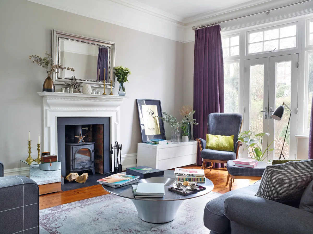
It gets so much light and has such a lovely view to the garden.’ The wall colour in here is Elephant’s Breath by Farrow & Ball, while the framed art print is by Zara Wood.

Bedroom
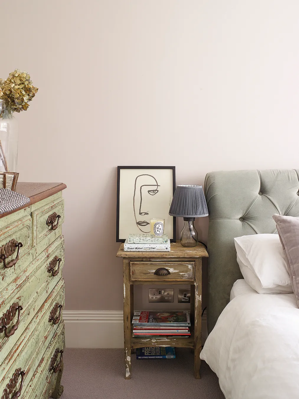
The pale pink in the couple’s bedroom is a classic, calming colour. When paired with a natural carpet and accessorised with tones of green and lilac, the pink works to create a soothing oasis upstairs.
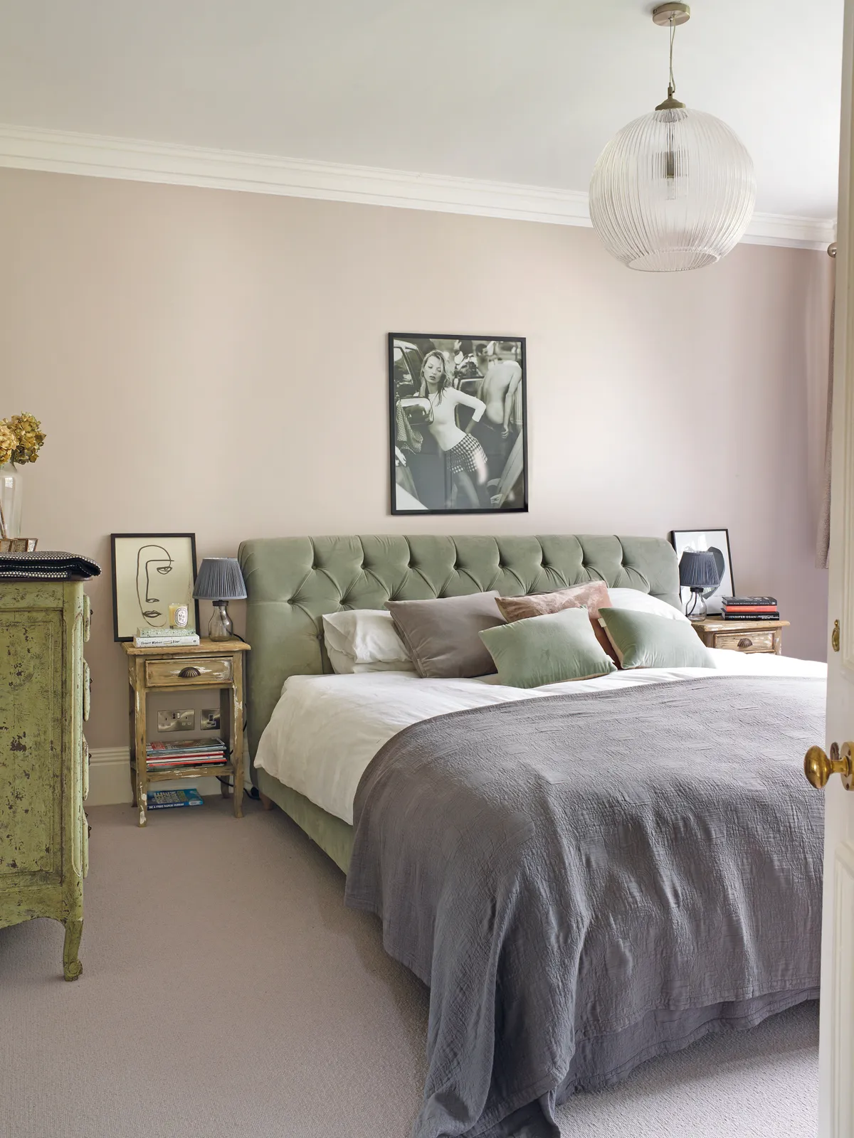
‘The bedside tables were my best buy,’ says Sarah.
‘They cost me £50 from a local antiques fair. I love that they’re original and unique pieces that bring a bit of rustic charm to the space.’
Bathroom
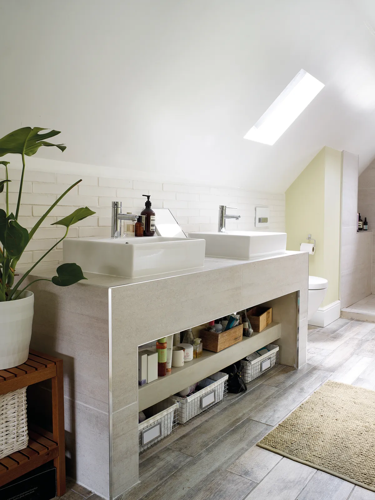
This bathroom was originally two small rooms that the couple knocked into one. ‘One weekend before we moved in, I came down to see the work and Phil said, ‘I’ve got something to show you’.
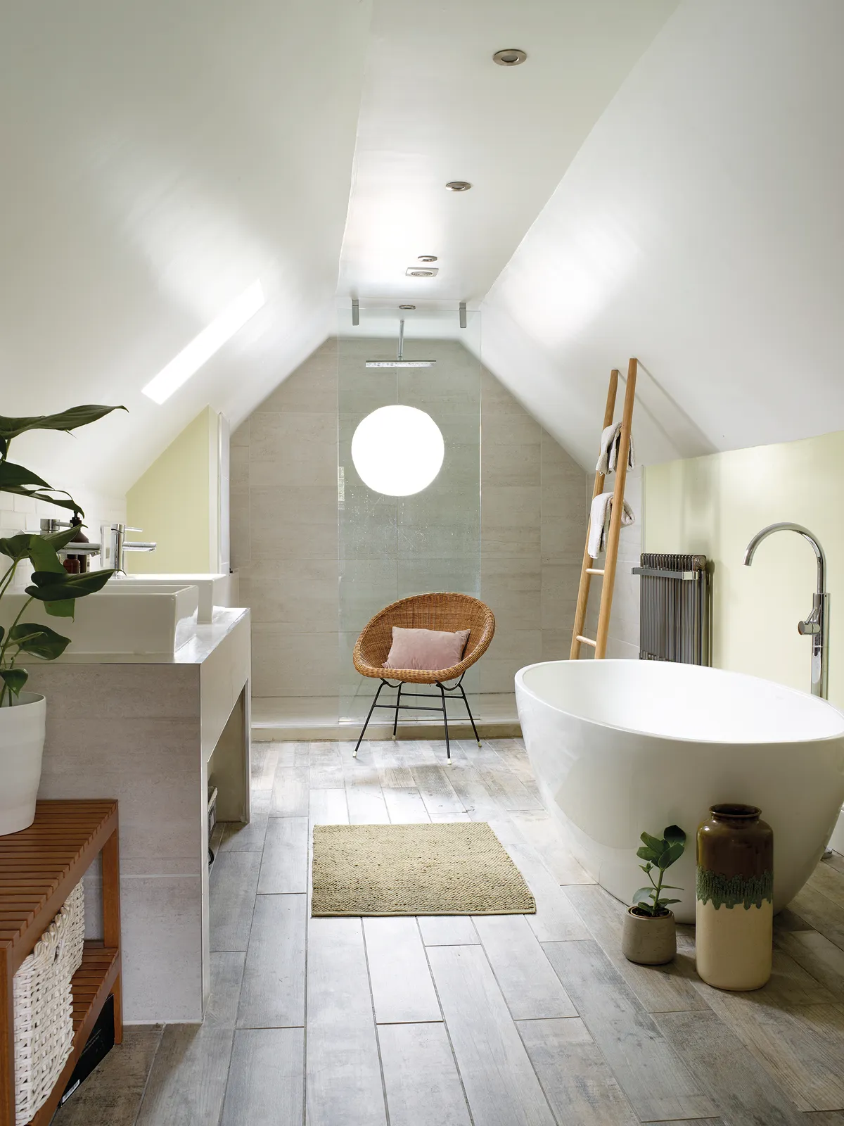
He’d got the guys to knock the two rooms through and create this spacious light and bright bathroom. I loved it and even though it’s way bigger than we need and an indulgent use of space, it’s my sanctuary and so relaxing.’
Theo's bedroom
Sarah has created a soothing scheme in two-year-old Theo’s nursery.
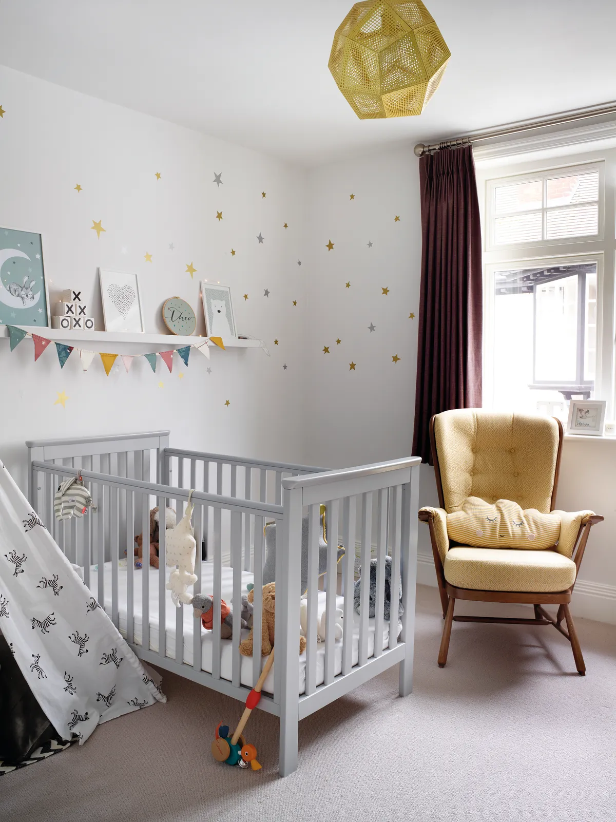
‘When I was on maternity leave, our local Søstrene Grene store was my haven!’
What I learned...
I definitely would have given myself more time and allowed for a lot more budget. I underestimated what the actual realities were. It all took a lot more time and a lot more money that I’d imagined.
If you’re like me and you like to mix things up and change things a lot, make sure that you don’t buy mega expensive things that might be on-trend now, but that you might not always love.’
It’s worth splurging! I looked for months to find cheap bedside lamps for our bedroom like the Loaf ones we now have. In the end I couldn’t find anything as nice, so I splurged. But every night I’m pleased I made the decision to get the ones I really wanted.

This is a digital version of a feature that originally appeared in Home Style magazine. For more inspirational home ideas, why not subscribe today?
