It’s not often you find a house that really is the perfect blank canvas, but this place was it. Structurally it was in great condition, and had even been replastered and repointed prior to selling.
Inside, the whole property had been decorated in shades of cream and light beige, so it really was like buying a clean sheet of paper, ready to make my mark.
When we first came here, it was to upsize with growing teenage kids, which is why we converted the loft for an extra bedroom.
Since they’ve all flown the nest, I’ve had a chance to pull the décor together, and a lot of it has been inspired by what’s become a small community of like-minded interior enthusiasts I’ve encountered on Instagram.
Inside, we’ve changed a lot of the surfaces and finishes to create more texture and interest. My lovely husband laid the new wooden parquet flooring in the hall in his spare time.
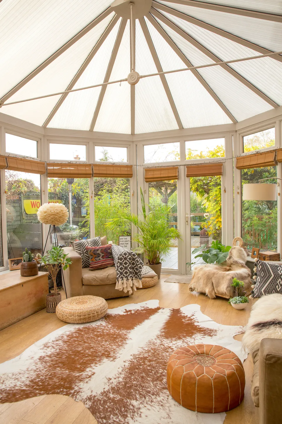
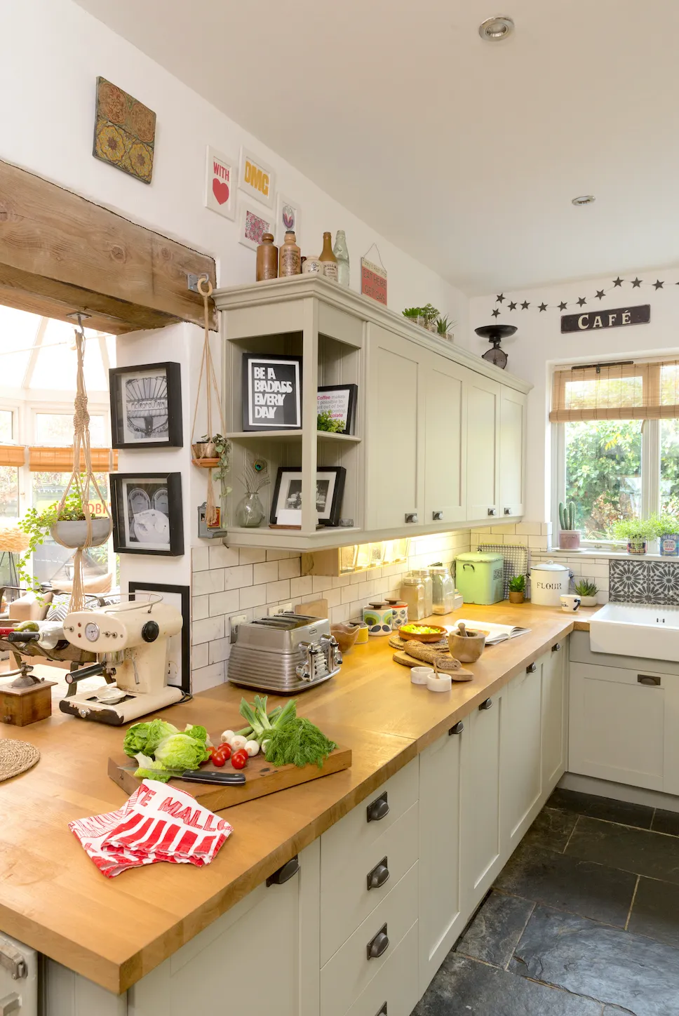
We also stripped off some dodgy stone cladding in the conservatory to expose the brickwork underneath and laid a slate floor in the kitchen. Meanwhile, we were able to revamp the kitchen just by replacing the doors and fitting new oak-block worktops and wall tiles.
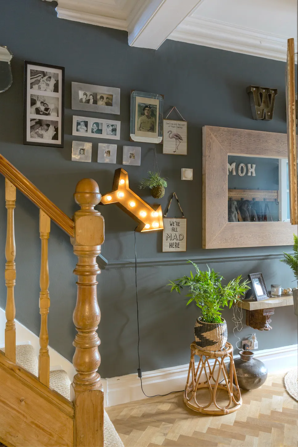
On top of this, the décor and furnishings are just things I love and have accumulated over the years; mirrors, vintage signs, retro lamps, studio pottery, all the things I can never resist. However you’d describe my interior style, the one thing it’s not is minimalist!
Owner profile
A bit about me I’m Danielle Le Petit, a maternity care assistant. I live with my husband, Martin, who’s a carpenter.
Where I live My home is a classic four-bedroom Victorian semi-detached house. It dates from 1894 and is situated in the leafy Surrey suburbs.
What I wanted to change Apart from putting my own stamp on the place, I wanted to change a lot of the finishes, such as the worktops, tiles, fascias and flooring.
How I made it my own We converted the loft into an en suite guest room and revamped the kitchen, then filled it with furnishings and finds I’d already collected over time.
My favourite part How the living/dining area has blended together. I feel like I’ve got the cosy and elegant combo just right there.

Living room / dining room
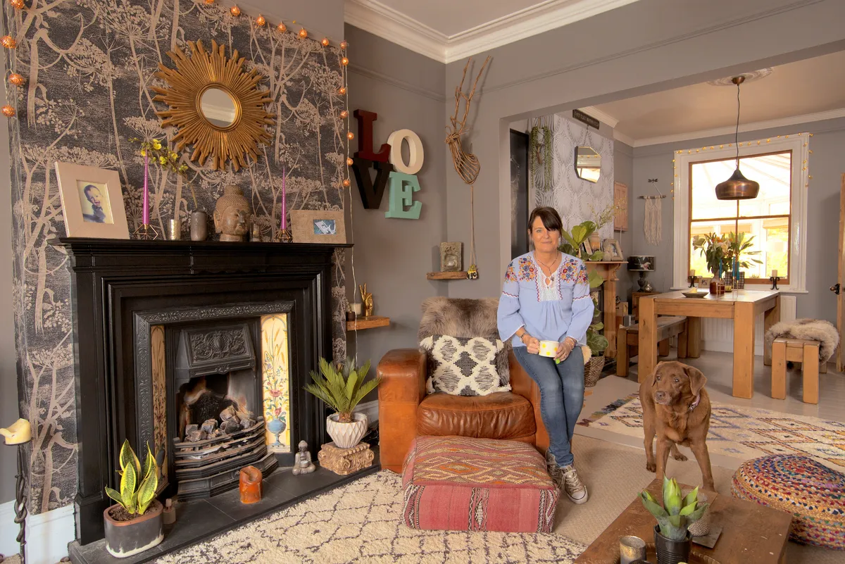
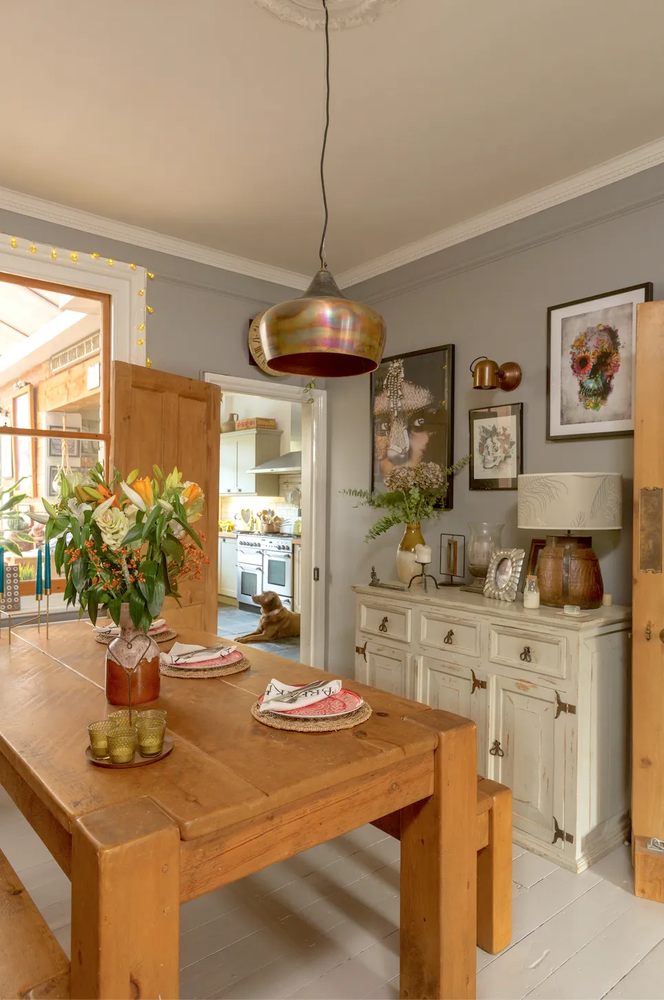
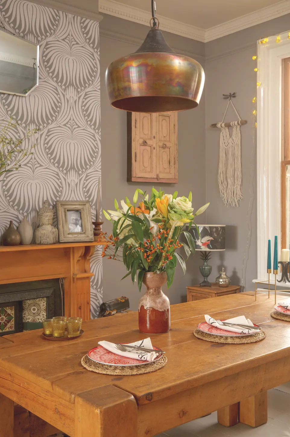
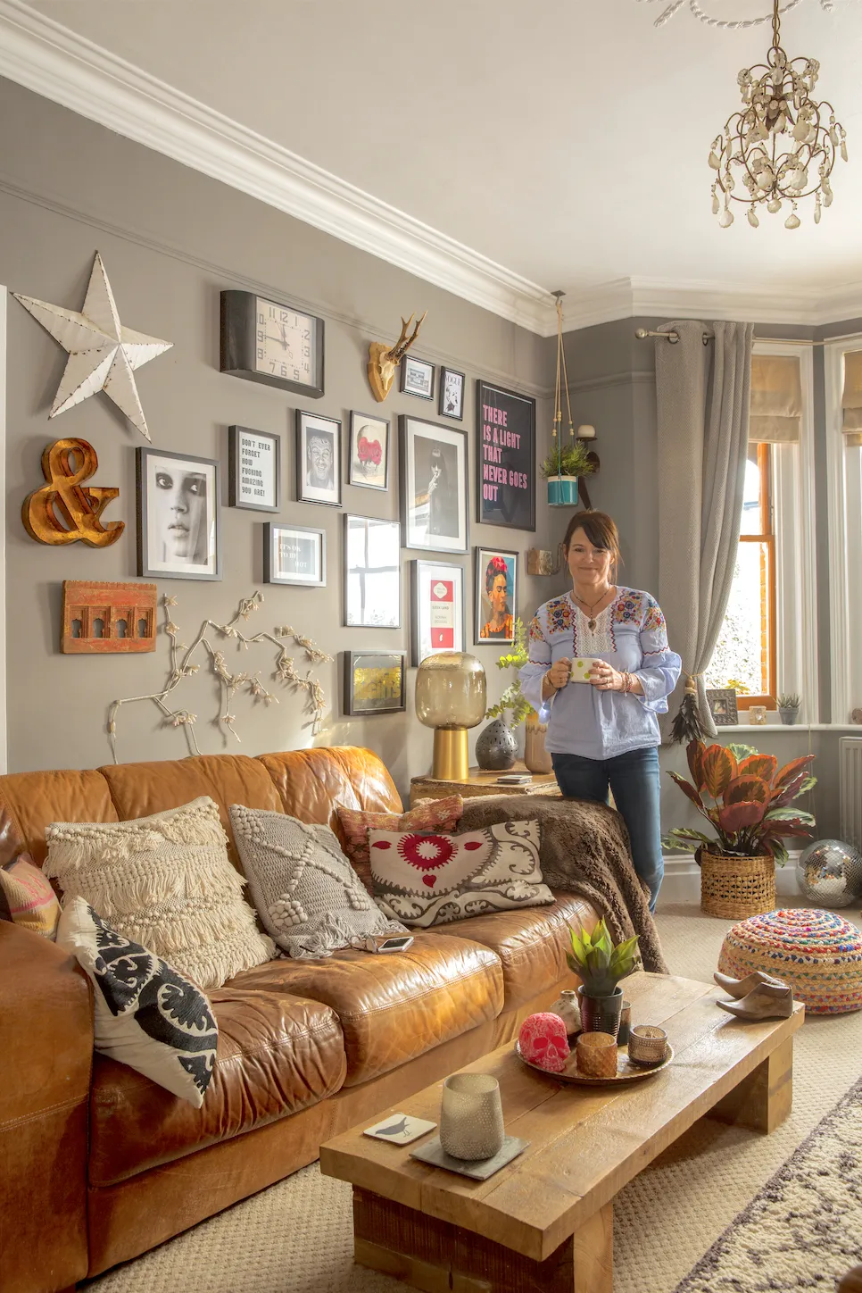
‘The living and dining room at the front of the house is one of my favourite spaces. As in most Victorian homes, it was obviously once two separate rooms that have since been knocked through, so I wanted the space to work as one while also feeling like distinct areas.
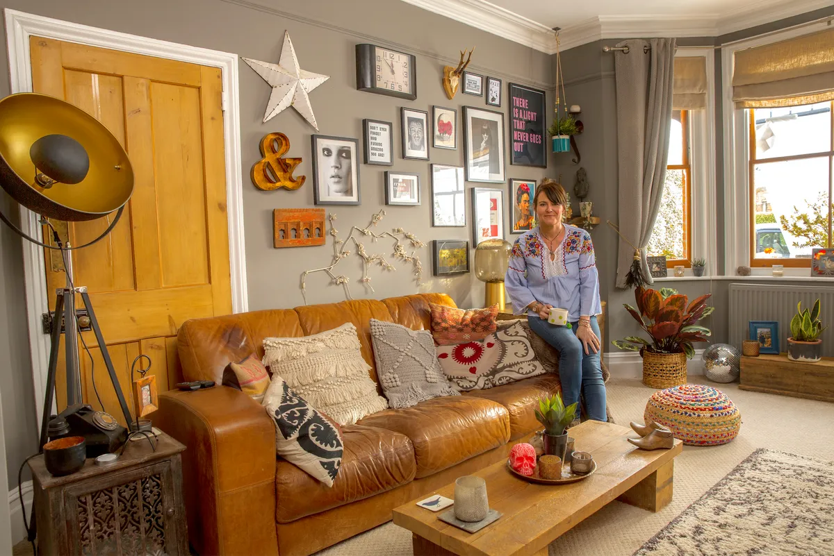
We have used two Farrow & Ball grey shades here – Worsted and Mole’s Breath – along with two different yet complementary wallpapers to clad the chimney breasts around each of the fireplaces. I think it’s helped achieve the effect we were going for.’
Kitchen
‘The existing kitchen was nearly new when we moved here, but it was almost entirely cream. Thanks to it being in such good condition, we were able to revamp the space without ripping it out. We simply changed the fronts for doors and panels in a Shaker style from Howdens.
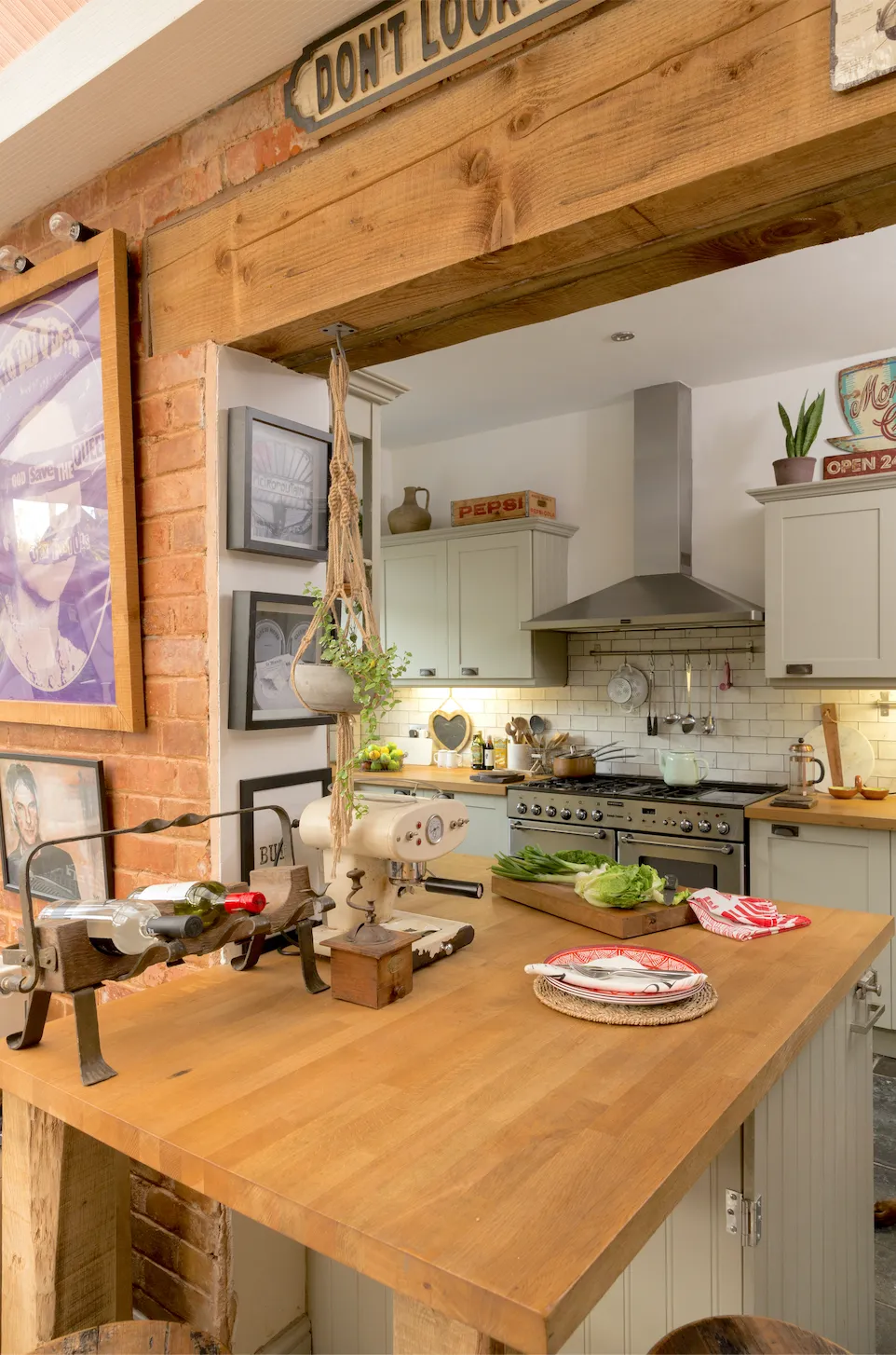
We chose a delicate French Grey shade, which works well with the new slate flooring and the monochrome feature tiles I treated myself to on the splashback behind the sink. When we put the new oak-block worktop on, we extended it slightly around the corner into the conservatory to help bring the two rooms together.’
Master bedroom
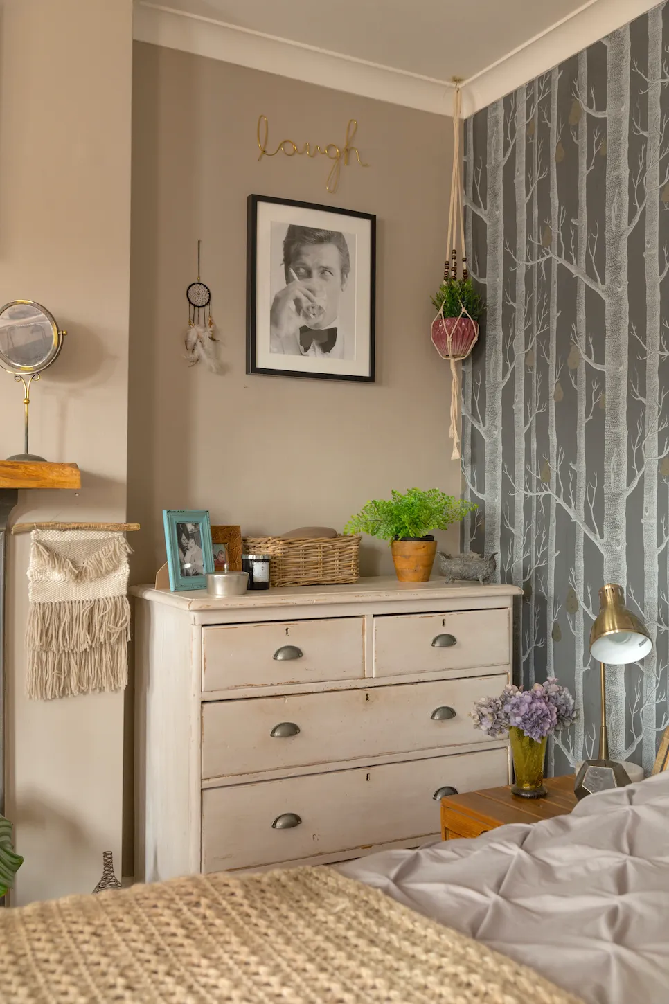
‘Sticking to one of my favourite combinations again, we painted the walls warm grey and incorporated a feature wall with monochrome-patterned paper behind the bed. This time I went for a very warm, light grey, with enough brown that it’s almost the colour of putty, and offset that with a paper that’s dominated by cool mid-greys.
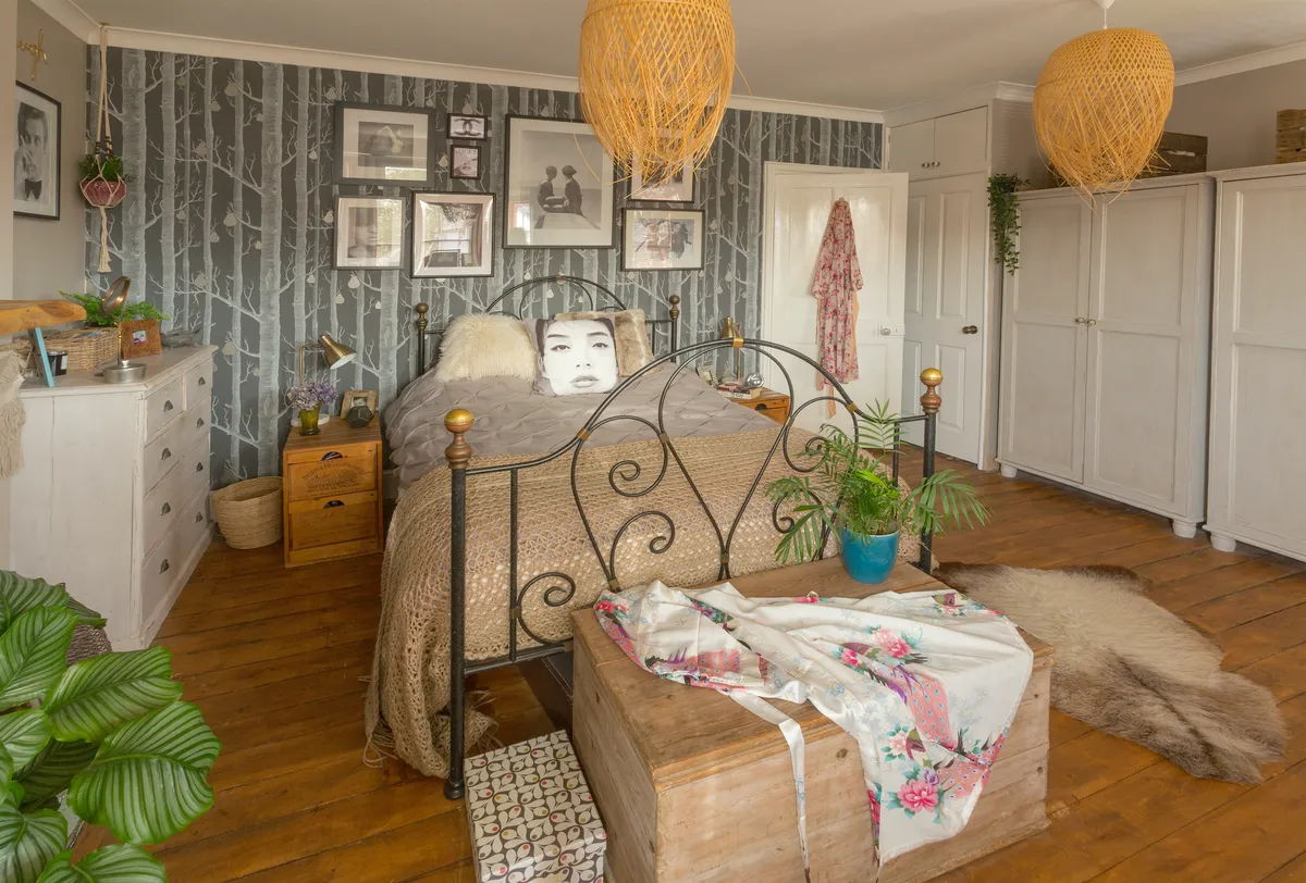
I think the natural tones of the wood floor that we exposed and sanded and the bamboo lampshades really complement the scheme in here. Similar-coloured throws and cushions on the bed are the finishing touch.’
Bathroom
‘Our bathroom isn’t particularly large, so it might be a bit of a surprise that I painted the walls in this dark colour, (Railings from Farrow & Ball).
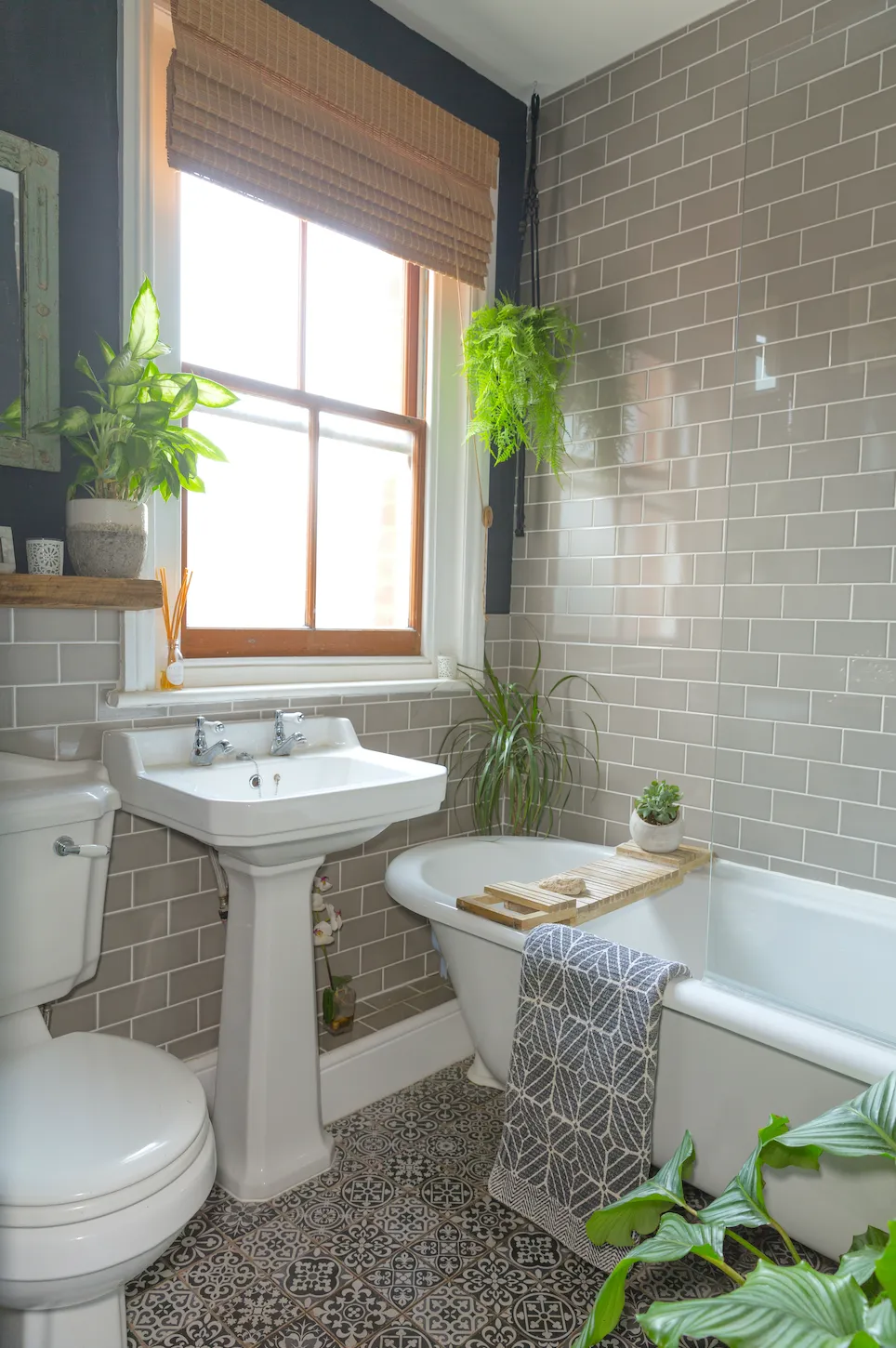
'However, I really believe that, while plain white will make a space feel bigger by reflecting light, a strong dark shade like this can do the same by absorbing it, with the extra bonus of adding more tones and interest as the light levels change. I think the white bathroom suite and light grey Metro tiles provide all the lightness this room needs.’

What I learned...
Take time to shop and research online to find imaginative alternatives to the expensive luxury items we all love. It’s super satisfying when you find great substitutes for a fraction of the price, and it’s become part of what’s defined my style.
Whether it’s on the shelf, mantlepiece or sideboard, make room to display all the things you’ve collected over a lifetime that you really cherish. This is what makes a house a home, rather than a showroom.
When you’re putting together an interior, it’s just as important to think about using interesting, complementary textures as it is to consider matching colour schemes.
