Farrow & Ball have revealed their colour trend predictions for 2022 - and there's definitely something for everyone in this year's picks!
Last year, we loved the beloved paint brand's 2021 predictions, with palettes focussed on deep red, timeless blue, smoky green and vibrant yellow. So what's in store for 2022?
This year, the five colours predicted to take the interiors scene by storm are: Breakfast Room Green, Stone Blue, School House White, Babouche and Incarnadine.
Farrow & Ball's long-serving colour curator, Joa Studholme, explains that the colours we'll be loving in the year ahead are a mixture of stripped-back hues harking back to simpler times, and more creative colours that celebrate the present moment.
'There is something inherently human in the colours that we are attracted to for 2022 as well as in the way we use them,' Joa says.
'They are an eclectic mix of the pure and the humble that evokes the warmth and harmony of a more innocent age while celebrating life today. Function goes hand in hand with ornament, using colours and finishes in unusual ways to celebrate the principles of utility, kindness and honesty.'
Not quite sure what that means? Read on to see the colours for yourself! And for budget alternatives, check out our guide to high street colour matches for Farrow & Ball.
On a practical note, if you need to update your painting kit, we've tried-and-tested a range of brush sets to find the best paint brushes and put together a buyer's guide of the best painting tools - you're welcome.
Farrow & Ball colours for 2022
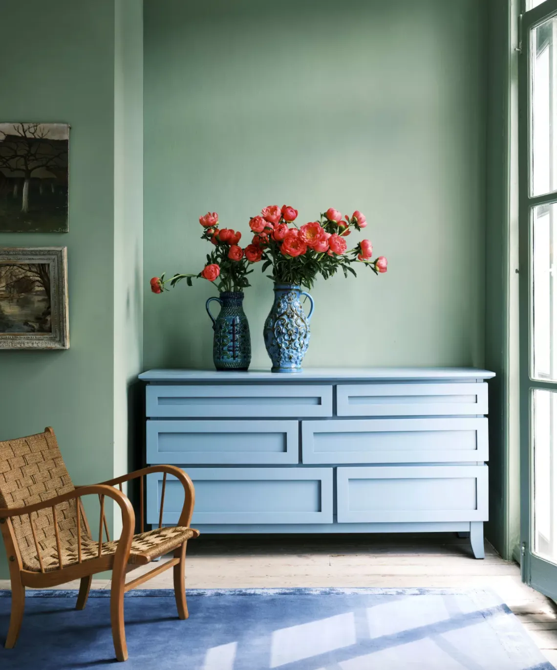
Breakfast Room Green

If you're even a casual interiors fan, you'll know that green has been having a moment just lately. Some colour experts have attributed its soaring popularity to the effects of the pandemic, when many of us spent more time in nature - but whatever the reason, it's a trend that we're loving!
Luckily, it seems set to continue into next year, as Farrow & Ball have named Breakfast Room Green one of their colours of 2022.
Described as the brand's 'most cheerful green', this natural-looking tone would look at home in a scheme inspired by cottagecore or even goblincore - yes, that's a real thing! Joa adds that this a wall painted in Breakfast Room Green 'creates an exceptional background for art' - and we definitely have to agree!
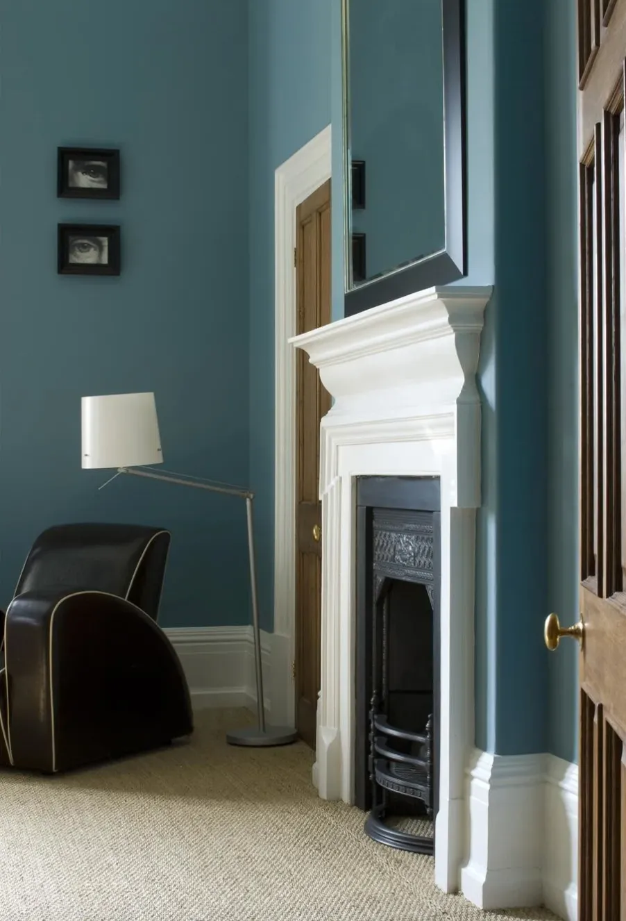
Stone Blue

Cool, timeless blues were a major theme in Farrow & Ball's palettes for 2021 - and we loved the choices of Pitch Blue, Ultra Marine Blue and Stiffkey Blue to create a clean and calm vibe.
However, we're excited to see a shift towards a warmer blue for the year to home. Stone Blue is a lively, inviting mid-blue that adds an immediate uplift wherever it's used. We think those soothing warm undertones make it a particularly clever choice if you're planning a blue bedroom or living room. Or why not take advantage of Stone Blue's elegant period vibe to give second-hand furniture a vintage-look makeover?
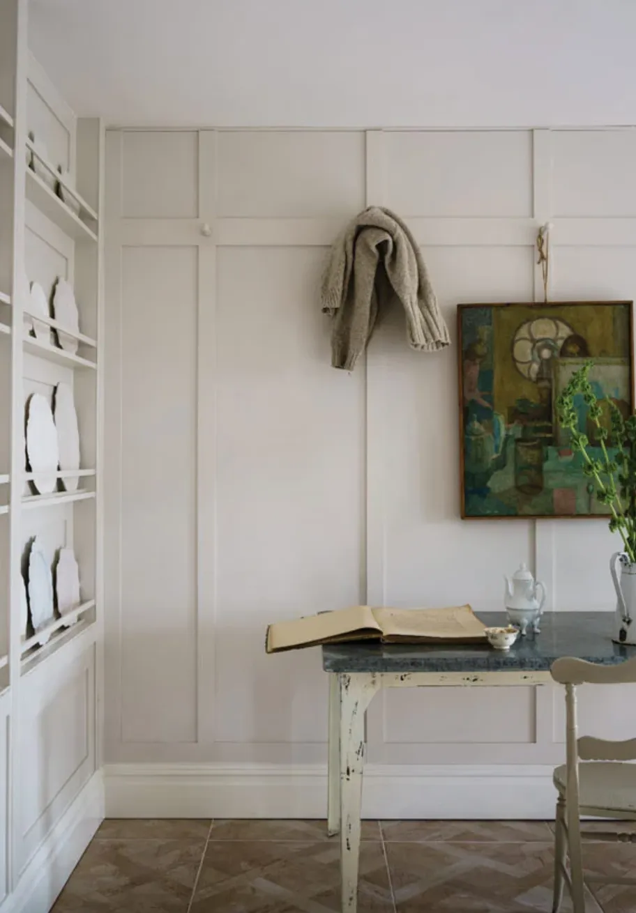
School House White

School House White is a perennially popular Farrow & Ball tone, and it's not hard to see why. This exceptionally versatile soft white takes its name from the walls of an old-fashioned schoolhouse and makes for an ideal choice if the cooler whites that dominate many contemporary schemes leave you cold.
Clean yet cosy, we think School House White looks particularly at-home in a Victorian or Edwardian home, or to lend a touch of warmth to a cool Scandi scheme.
Babouche

'In 2022 we will relish brighter colours that herald a return to normality,' says Joa. 'The cheerful and uncomplicated Babouche is the perfect tone for this task. While bold, it never feels garish or overpowering.'
Until now one of Farrow & Ball's lesser-known colours, Babouche is named after the soft slippers traditionally worn in Morocco. This vibrant, uplifting yellow would suit a sunny kitchen or hallway, and looks equally at home in a contemporary or period decor scheme,
And if you're not feeling bold enough for a whole room makeover, this eye-catching colour is wonderful for accents, especially against a dark backdrop - think a painted radiator, front door or fireplace.
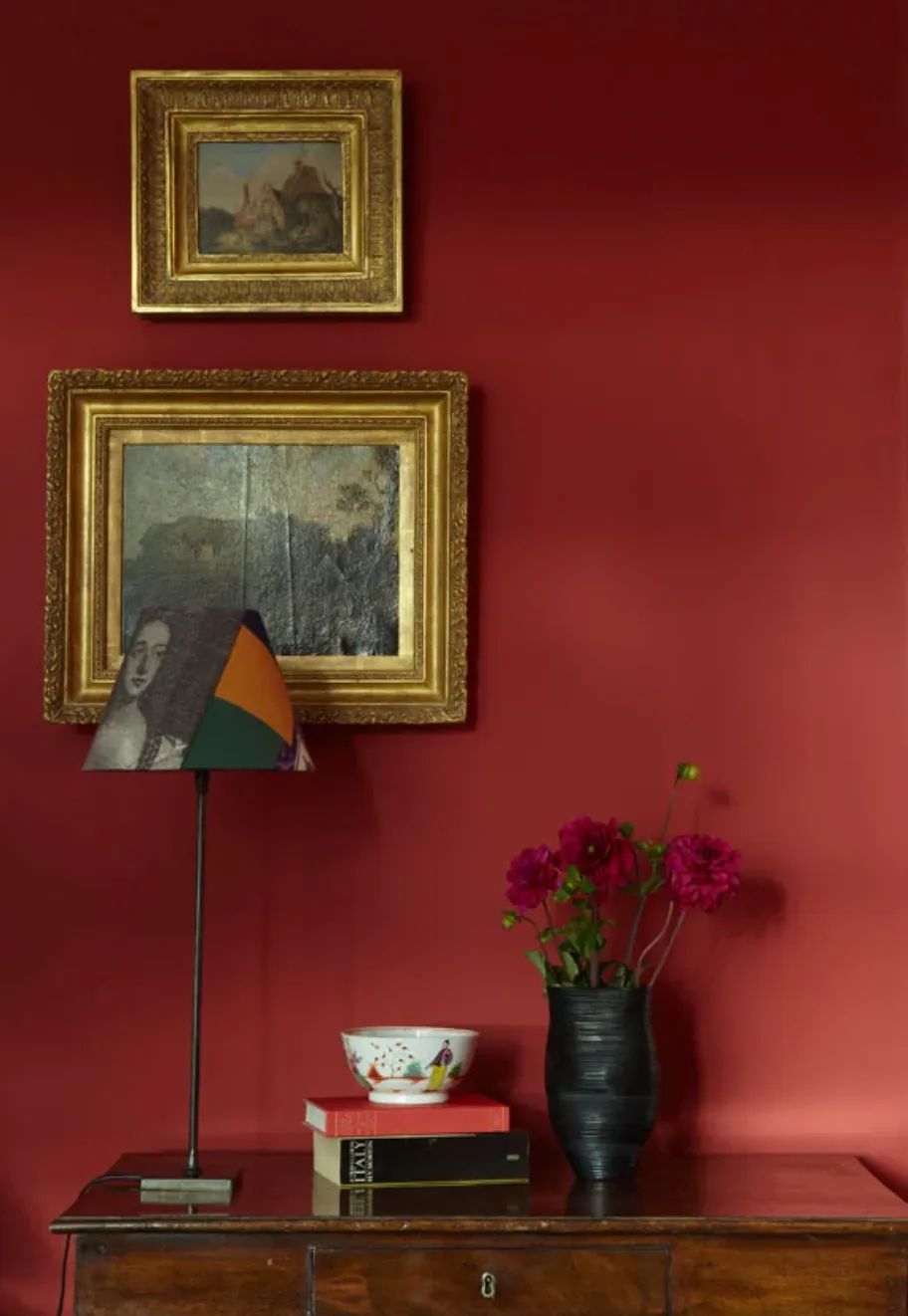
Incarnadine

Another one of Farrow & Ball's hidden gems, Incarnadine is an unapologetically rich and glamorous shade of crimson that perfectly fits into the recent trend towards deep and dramatic colours.
You don't need to have a stately home to show off Incarnadine to best effect, though - contrary to popular belief, deep and bold colours can work wonderfully to turn small spaces into jewel-toned havens - just check out our rich burgundy red home decor ideas if you don't believe us! If you're looking for something less intense, consider painting halfway up your walls in Incarnadine, using a white shade for the upper half. We also think this would make a great colour for upcycling a chair or wardrobe into a statement piece.
Feeling inspired? Check out our guide to the top colours of 2022, as well as 2022 home decor trends and 2022 kitchen decor ideas. Can't find the shade you're looking for? Why not check out the new collection of Lick paint colours, which include restful tones inspired by nature.

