Pattern innovator Sian Elis Thomas has been making waves in the interiors industry since 2012.
Her brand was featured in Sunday Times' Top 30 Fabric and Wallpaper list and she has collaborated with numerous household name companies, including Marks & Spencer and Hallmark. Now, in addition to her Scandinavian inspired textiles, Sian works as a university lecturer in Cardiff where she lives.
As a child is this the career path you always dreamed of taking?
I always wanted to do something creative and when I was little I spent hours at the kitchen worktop drawing and making. I have memories of creating abstract patterns with felt tips a lot; I was also a big fan of Spirograph and that was way before I knew what a surface pattern designer was. My mum was really into pattern in our house, from floral greens to dotty monochromes and, of course, William Morris’ Willow pattern – adorning sofas, curtains, carpets and walls. They all had a big impact on me.

How would you describe your aesthetic?
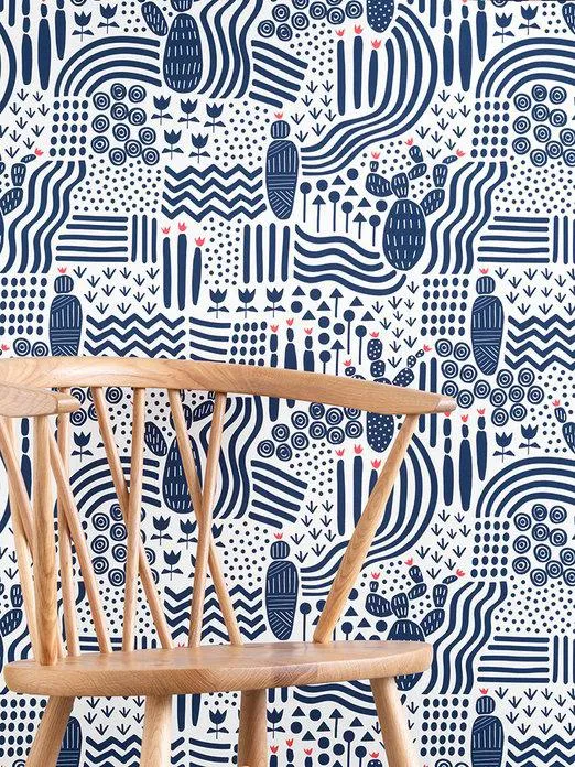
I create lively prints that balance bold graphic lines with a fresh colour palette. I trained as a graphic designer, so I love the clean aspects of Scandi pattern. I’m also drawn to the mid-century era because many interesting patterns came out of big fabric houses at the time.
How does an idea progress from the initial thought to the final product?
When I’m designing a new collection, I think about the overarching concept, i.e. geometric, floral, Moorish, for example. I also think about the colour palette and tend to work within the same shades, across a broad spectrum. So I pick the colours based on trends coming up, or a gap within my current range. I’d then make a mood board based around these ideas and this helps to create my vision and direction. I start drawing and experimenting and I try different mediums and work to progress my prints but stay within my brand. The colouring process is done digitally, where I’ll test out various combinations until I’m happy. I play a lot with scale and I like my designs to have just the right amount of interest and complexity in the detail, but to speak clearly overall. That can be a difficult balancing act at times. The next stage is to sample designs with the printers, before deciding on the final designs for the collection.

Can you tell us about your studio?
It’s in Cardiff Bay, next to where the busy docks were during the coal industry. The building itself is an old mariner’s provisions and bonded store. It’s light with big beautiful doors. It’s full of colourful stock and ply and OSB board tables which I made to my required size for working and making areas.
Where do you get most of your inspiration from – any travels?
I’ve travelled quite a bit; I have taken extensive inspiration from Moorish and Middle Eastern patterns found on buildings in India, Southern Spain and Portugal. I’ve also taken patterns from a trip to Peru which have ended up in my collections (Horseshoe Arch, for example). My boyfriend is a New Yorker so we have made many trips there, and we lived in Israel together for six months, which is full of ancient buildings with beautiful patterns.

Do you have a favourite print or pattern you’ve worked on so far and, if so, why?
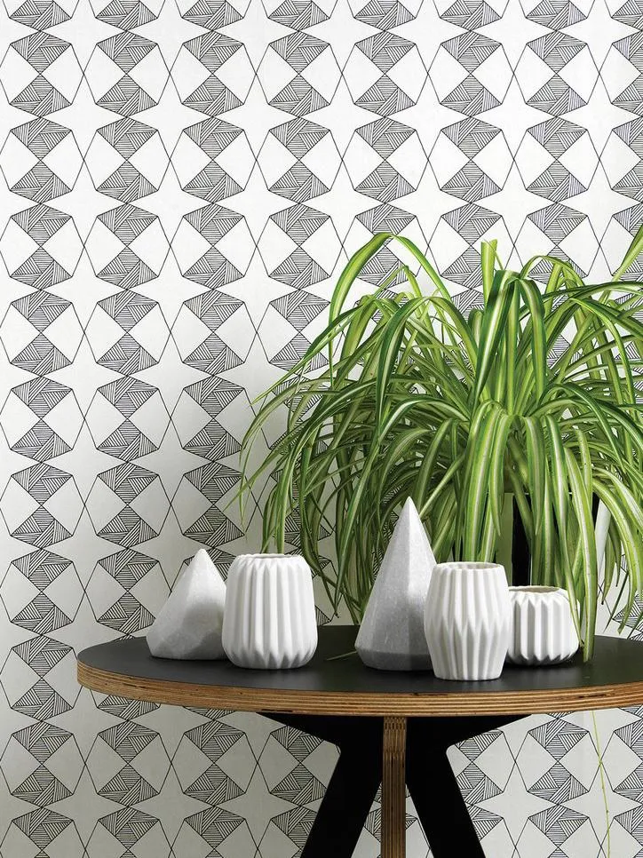
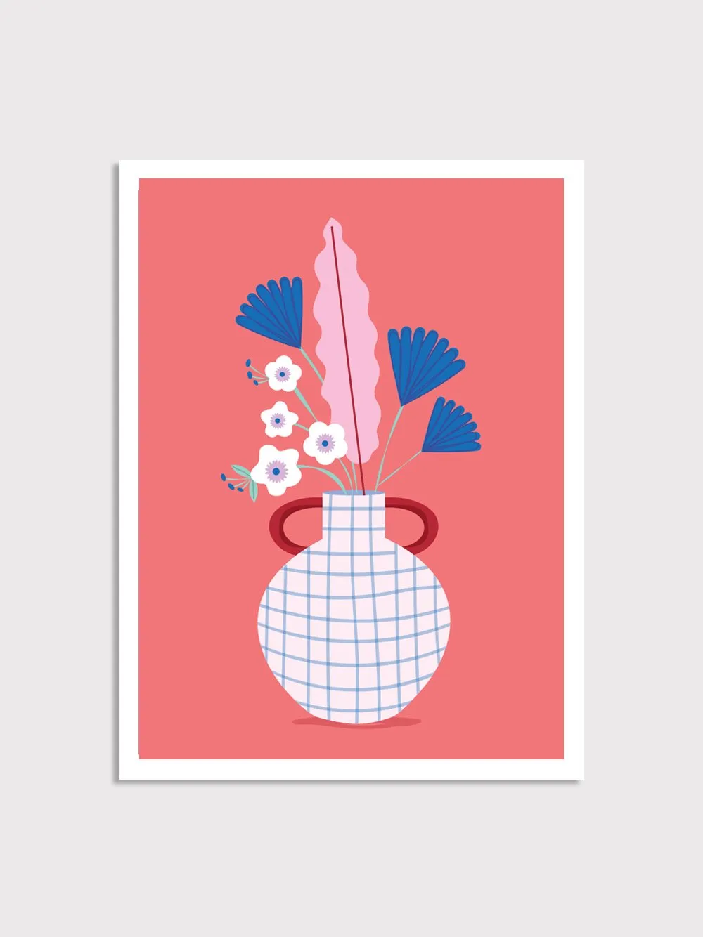
I think my favourites are the Riad and Etoile patterns. I love that the Etoile is a distilled version of the Riad yet looks so different in its nature, i.e. delicate versus bold. And I love the graphicness of them. It’s funny, as both of them are black and white, and I love colour so much. Maybe it’s because it was quite a daring thing for me to go so monochrome. And I also loved working on the more landscape artworks I have done for my cards because they are more illustrative rather than pure pattern – and they’re fun.
Are there any materials you haven’t worked with yet that you’d like to use?
I have done some sampling on some natural linens recently, which I would like to bring into my collections – I loved the combination of the graphic modern shapes and colours on the more traditional material. I’d really love to do a range of melamine and tins because I think their '50s nature would work so well with my designs.

