
I'm Nicola Walch, 42, a marketing manager, and I live with my husband, James, 43, an architect, and our two children, George, 12, and Emilia, who is nine, and our cat, Ralph.
We live in a 1970s detached four-bedroom house in Shenstone, a village near Lichfield, Staffordshire.
'We’d outgrown our previous home and needed more space, so were on the hunt for a project where James could put his architectural credentials to use and I could add my creativity.
'We liked the uniqueness of this house: it’s triangle shaped and had already been extended twice so there was lots of room to play with. James took the measurements when we viewed the place so during the buying process, he drew up plans to reconfigure the space. He also plotted the kitchen design using specialist software.
'We chose most of the fixtures and fittings beforehand which meant that we had all the trades ready to go when we moved in. We initially created a plan which included renovating both bathrooms, but the rise in costs after Covid meant that knocking down the walls and creating the open-plan space downstairs wiped out the budget. As that space was our priority, we were determined to do it properly.
'We see this as our forever home, so we’re happy to wait and save to finish the remaining rooms. It was hard work living here during the renovation as I work from home and my office doubled as our living space. But I absolutely love what we’ve achieved: it reflects everything we love about interiors, so it was definitely worth the difficult times.'
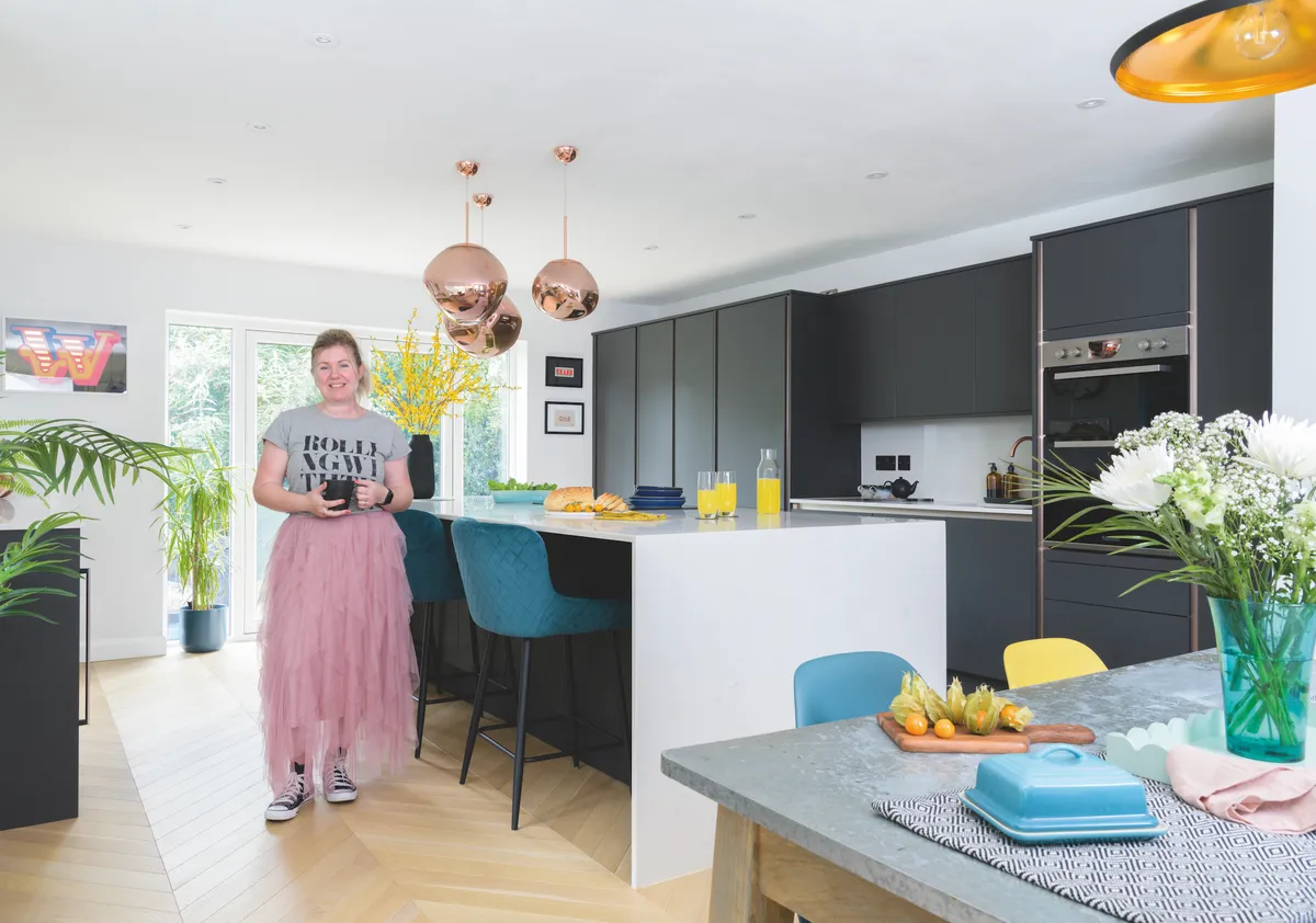
Kitchen-diner
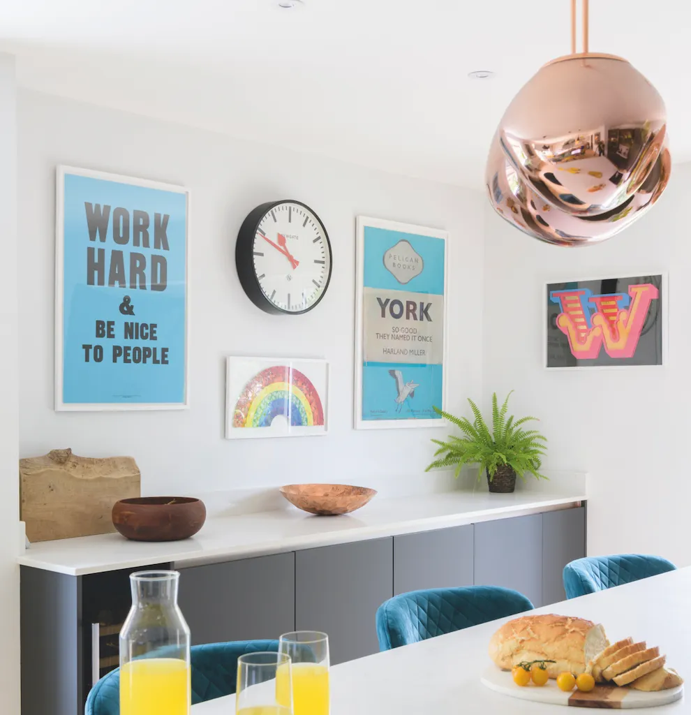
'After looking in lots of kitchen showrooms, we finally went for dark grey cabinets from Howdens – though we chose the doors with copper trim, the copper tap and pendant light fittings to elevate the look.
'I picked quartz worktops with a grey vein to complement the units and although I wanted a large island, I didn’t realise quite how big it needed to be to fill the space. Still, the extra kitchen storage it gives is great as everything is hidden away.
'We didn’t want an extractor hood hanging down as that would’ve meant installing a false ceiling to vent it, so we chose a downward extractor fan instead, adding to the streamlined look we love. But I think our best idea is the bank of cupboards at the end of the room that hides a ‘secret’ door leading into the utility room.'
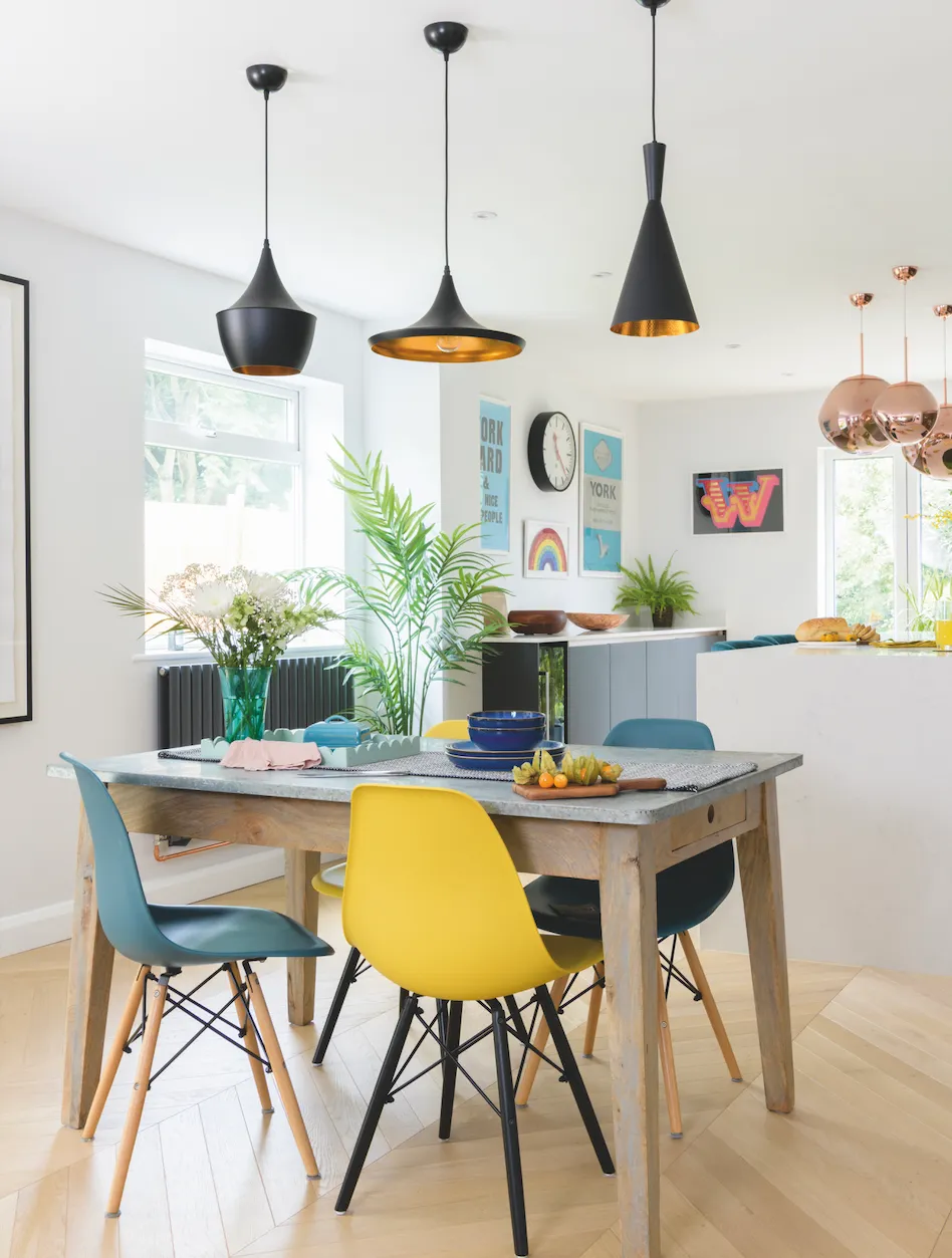
'This is a really large space but zoning it and putting the dining area in the middle has given it a good flow, and the table creates a breakaway area between the kitchen and snug.
'We chose chevron flooring throughout to give the illusion of a longer space and we wanted wood to warm up the all-white room, which initially looked a bit clinical. Laying the wooden planks was tricky and our original floorers walked off the job, which was really stressful as they just left the wood dumped on the floor! Luckily, we found a replacement fitter after a few weeks who did a great job.
'The reason we chose white walls was so that we can change up the look with accessories and add the colour we love without the huge commitment of having to paint the entire space.'
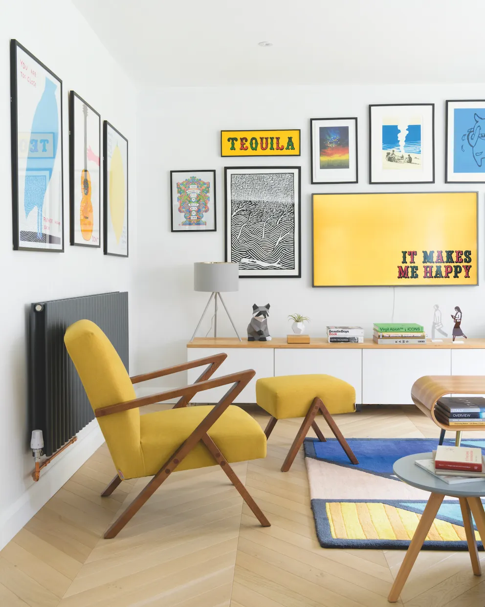
Snug
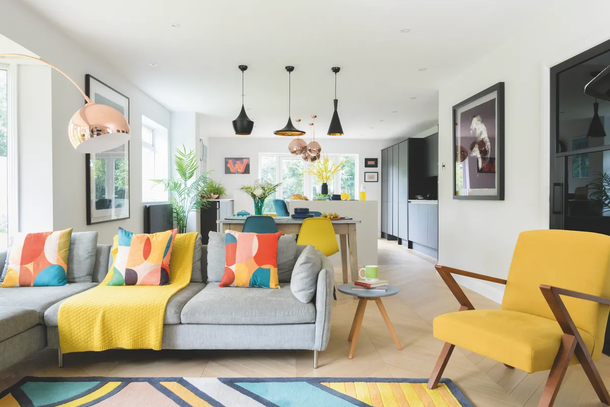
'We wanted an open-plan space but we didn’t want it to feel cavernous, so we chose the L-shaped sofa and large rug to create and zone a self-contained snug area.
'Our TV broke during lockdown, so we treated ourselves to a Samsung Frame which is how the gallery wall started. When the TV was hung on the wall and images displayed, it looked like a piece of art so we decided to add more pictures to surround it. We had the media unit hanging off the wall in our last house but it fell down as we weren’t as good at DIY then, so we decided to keep it low in here, and it’s a really useful piece of kit as all the TV and gaming tech is hidden away. We also had a piece of bespoke wood attached to the white top to add some warmth and texture.'
Hallway
'When we first opened the door into this place, I fell in love with the hallway with its 1970s staircase and open risers, and the exposed brick wall. But we knew renovating this space would be a big job as the original, beautiful parquet floor was rotten so it all had to be removed. We replaced it with Amtico vinyl floor tiles, a low maintenance flooring option that’s hardwearing, easy to clean and can take the children running in and out, but the design is still a nod to the original flooring.
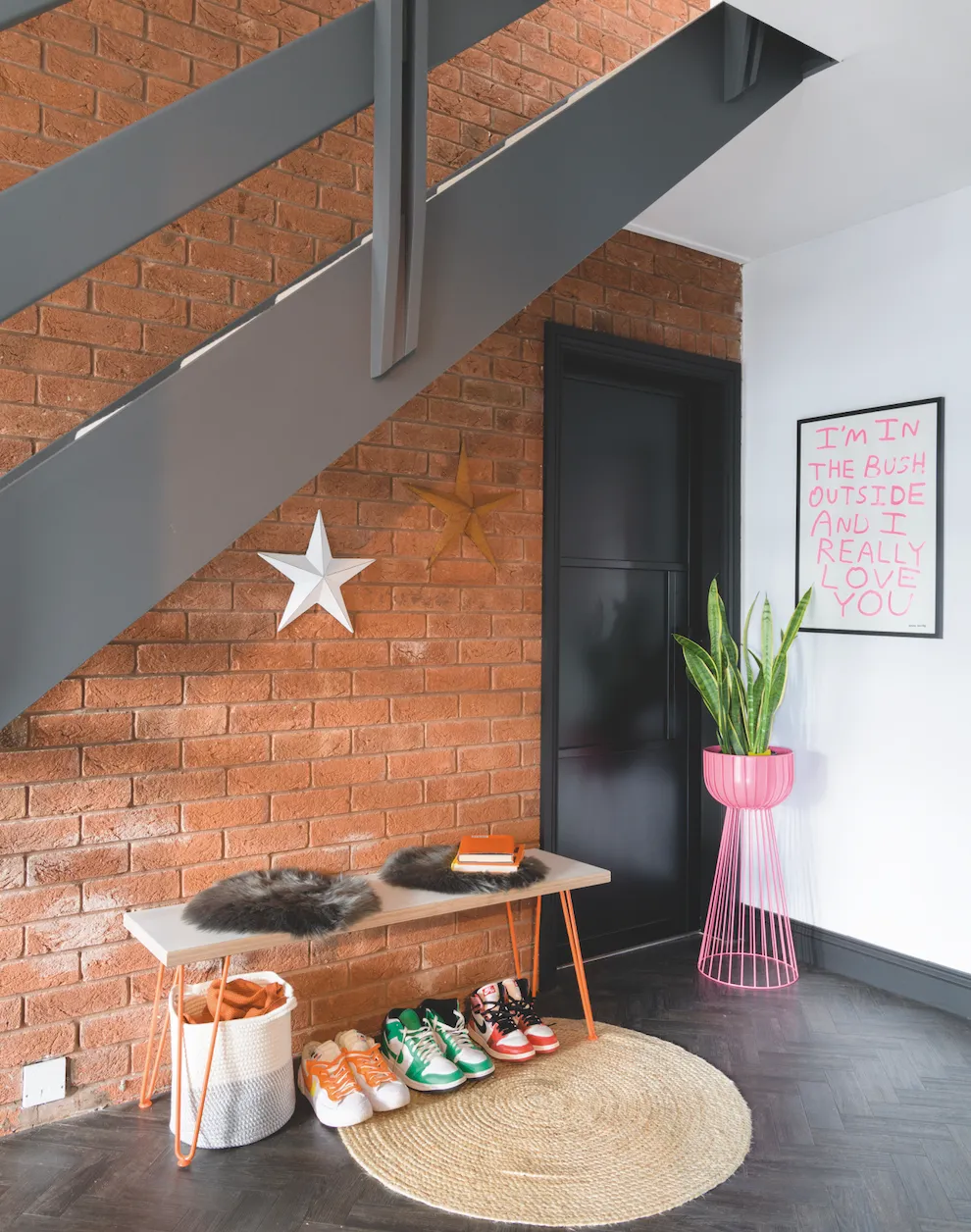
'It took me two months to sand the stairs and banister, in-between work and looking after the kids. They were originally stained teak but I wanted to brighten the space and painting them grey and choosing dark flooring has conversely helped, too.'
Living room
'There was originally a good quality kitchen in here but we wanted to turn the space into a formal living room, so we donated the cabinets to a charity.

'The room was plastered and then left as a shell for months as most of our budget went on the open-plan kitchen space so we couldn’t initially afford to carpet or decorate in here.
'I wanted a relaxed, grown-up space for myself and James and the two pictures by James McQueen were the starting point for the scheme. We added the coving ourselves then I chose a blue shade, Ink Well by Dulux, for the walls. Although I had initial concerns it would look too dark, the huge bay window throws around lots of light.
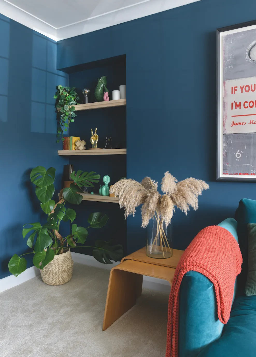
'We chose sumptuous velvet furniture to give the all-round cosy vibe we wanted and added alcove shelves in the space created out of a blocked-up doorway.'
Office
'During lockdown, I started working full time from home and needed a calming office that would spark my creativity. I couldn’t concentrate in the original space as it was covered in a bright yellow and black rose wallpaper, so we ripped it off within the first week and painted the room a very soft grey.
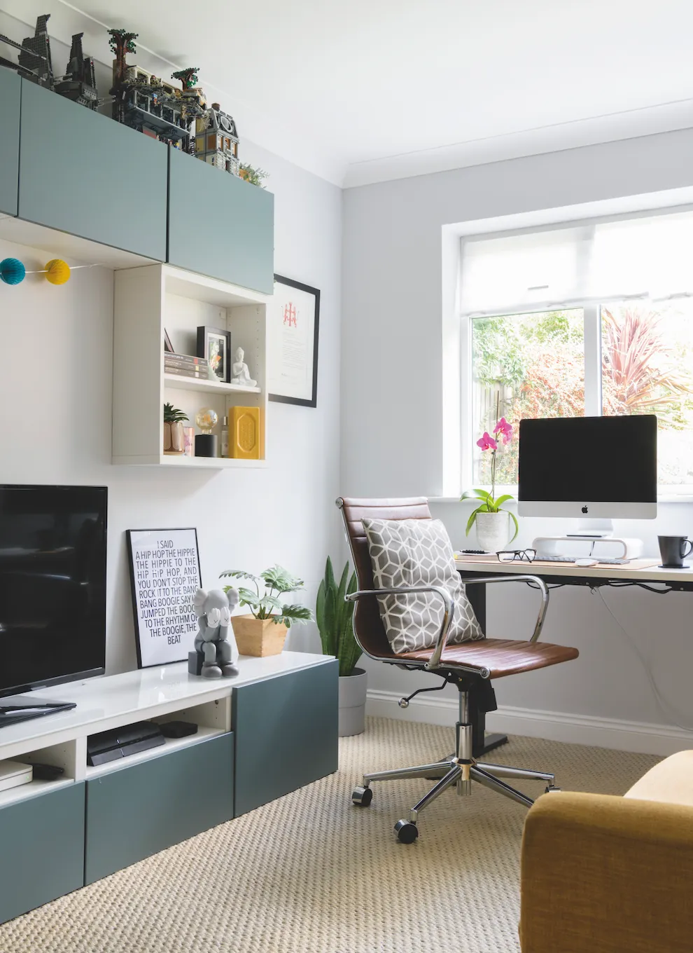
'The IKEA wall and base units are a great design solution to add plenty of storage but, as this room is fairly small, they feel less claustrophobic than floor-to-ceiling units would.
'James initially put some of his art works up in here but as I’m here everyday, it was important that the room worked for me so I started buying art for myself and began adding more colourful touches. Putting the desk by the window made sense as it gives me natural light and a nice view.'
Main bedroom
'Our bedroom is our sanctuary, and we learned the importance of comfort and sleep many years ago so having a clutter-free, relaxed space was top of the agenda.
'We haven’t decorated in here yet but luckily, after all the colours and patterns we inherited downstairs, the décor was quite neutral in here and the tranquillity works for me. So we simply added accessories to make the room feel a bit more personal.
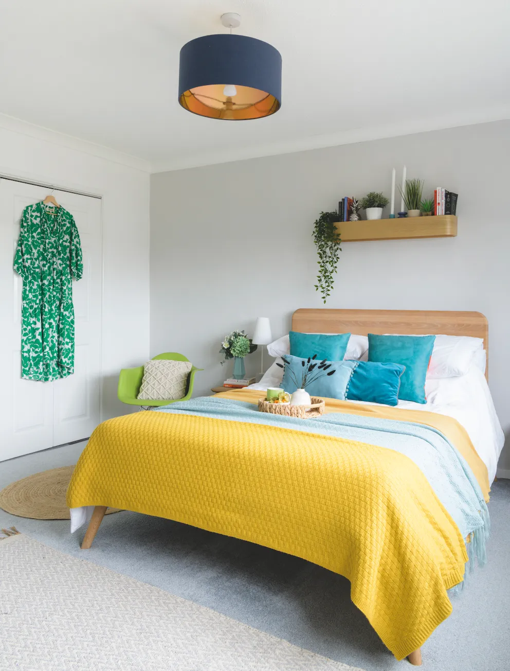
'Injecting colour using bedding is an easy way to make the room feel warm and inviting, and the soft grey carpet was already laid and is something we may have chosen so that was a bonus.
'We already had the bed and matching bedside tables, so we bought the shelf above to add some interest to the wall and provide a bit of extra storage and display space.'
Emilia's bedroom
'Although this room didn’t really need any work, we gave it a quick refresh with a lick of white paint and changed the light fitting as the original one was huge and overwhelmed the room.
'I wanted to personalise the all-white space for Emilia so we hung the canopy over the bed and added fun pink tones and fairy lights. I originally used the IKEA units to store nappies and other baby things, but Emilia’s started gathering a lot of crafting materials and the units work really well to keep books to hand and hide pens and paints when not in use.
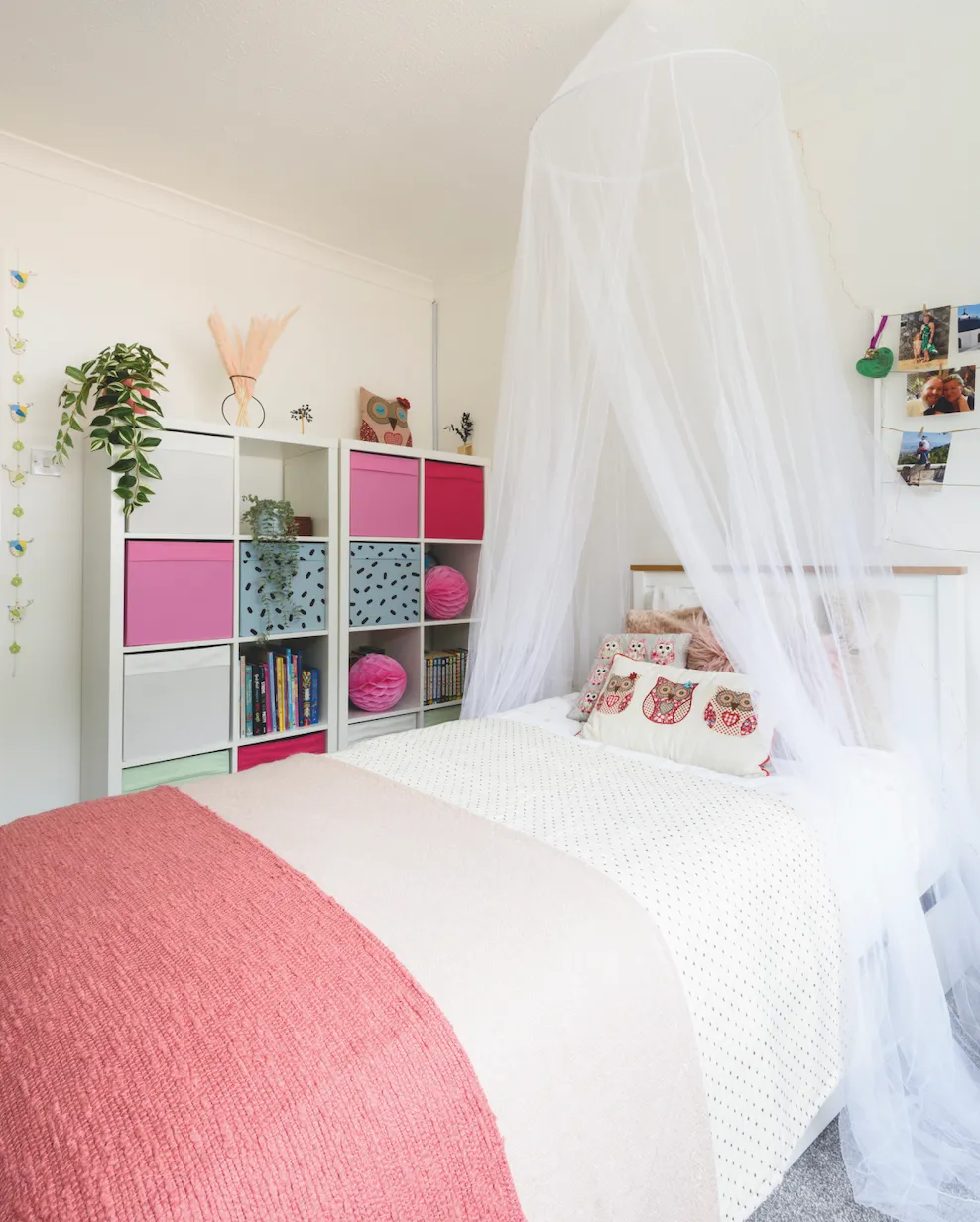
'Emilia has a really good eye for design and chose the colourful cubes herself, and we’re making plans to do some sort of colour blocking in here – we just need to decide on the design!'
Bathroom
'We haven’t done anything to the bathroom yet, either cosmetically or by changing the layout as I’m waiting until we can do a full renovation, which will definitely include colour, and maybe a wet room with pink tiles.
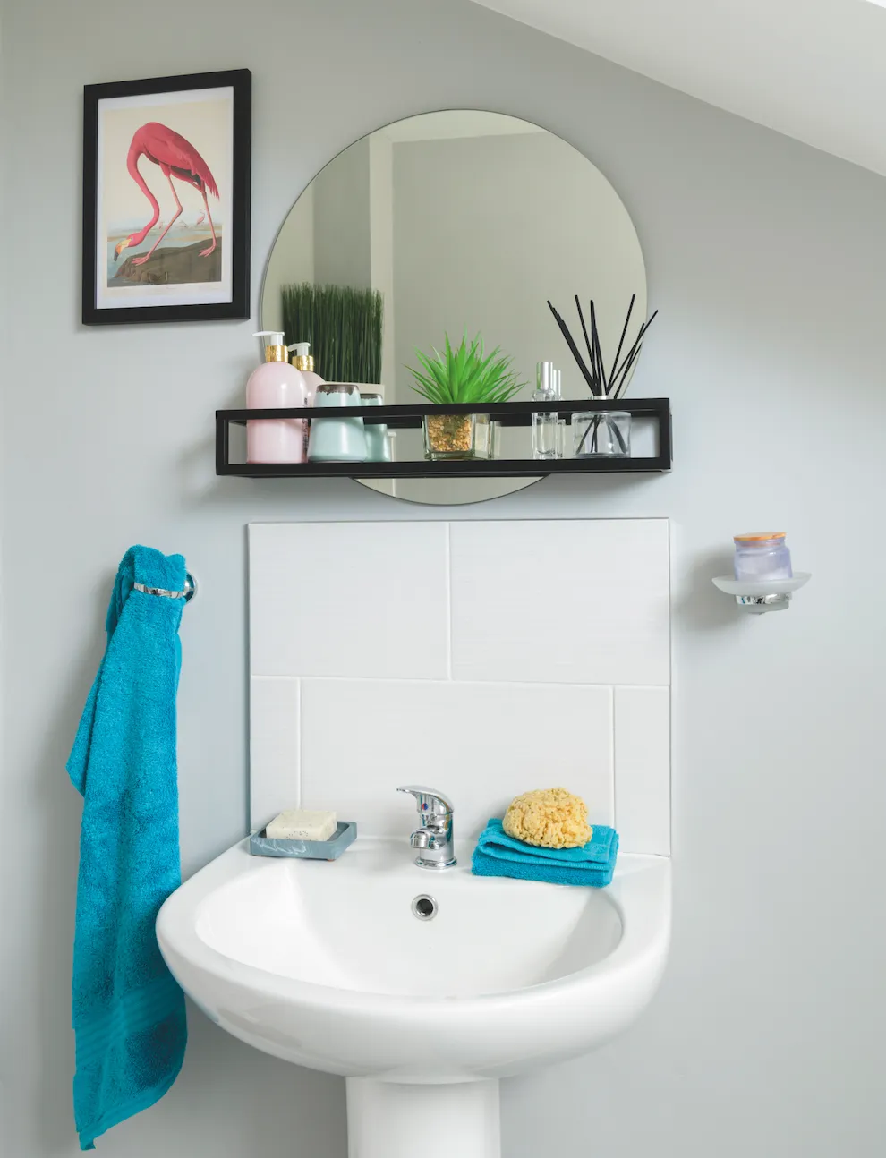
'But for now, I like the contemporary feel of the suite, and being white and grey means that it’s neutral enough to live with while we save. I’ve simply personalised the room by adding prints, a quick and easy way to add colour to a space without having to invest. We also put up the storage mirror, which is a small but useful addition.'
What I learnt - Nicola's three tips
1. Trust the process! The first coat of paint on the banister looked terrible, but on the second coat I could see where it was going, and then the third one gave the ‘wow’ look.
2. Get the tradespeople who’ll actually be doing a job to look and quote. The original floorers quit because they said the floor wasn’t ready but the salesman had said it was good to go.
3. If you can, go with one contractor who can project manage the whole job. We went with independent trades and, as I was working from home, I had to manage dates, workloads and arrival of materials and such, which was really stressful.
Feature and styling Lisa Moses
Photography Caroline Mardon